Monday, April 30, 2012

Monochromatic Man Card

I have to get my brain around designing Man-Cards again.  With Father's Day coming up soon I need to start planning my projects for next month's classes.  That means designing cards for the men in my life, which is always a challenge.  For this card I grabbed a piece of watercolour paper I had run through my Big Shot using the Fancy Fan letterpress plate, which is retiring at the end of May.  It has been laying on my desk for a while, so I figured it was about time I put it to use!  With that as my background I created this monochromatic card, which I hope, would be perfect for some man...somewhere...and also works for this weeks Stampin' Royalty challenge

Monochromatic Man-Card for SR121 featuring the Artistic Etchings set with sentiment from Loving Thoughts

Inside detail
This card was really quick and easy to pull together, thanks to the wonderful stamp set I used.  Artistic Etchings has been one of my favourite sets since it first appeared in the catalogue two years ago. Thankfully it was spared the retirement axe this time around, or there would have been some serious wailing and gnashing of teeth on my part!  The button, in case you're wondering, is one of the retired Big Designer Buttons that I fell in love with last year.  I picked up a bunch last Christmas when they were on the Clearance Rack...sorry if you missed out on that deal...chances are I bought them all!  In any case, I have a ton of those buttons and am hoarding them like a crazy woman.  They only get pulled out when needed as the perfect touch to finish a card...I think this particular card was worthy of a button, no?

Saturday, April 28, 2012

Sayonara Silhouettes

Another long-time favourite stamp set that is retiring at the end of May is Pocket Silhouettes.  This was another one of my very first purchases when I first started stamping.  In honour of its retirement, I created this super-simple card...

Single-layer card featuring the soon-to-be-retired Pocket Silhouettes set.

This design was inspired by several I've seen on Pinterest...if you're not on there yet, you need to be!  So much fabulous inspiration!  Here is what I did to put this together:
Starting with a whisper white card base, I masked off a section in the middle using self-adhesive notes.  I then sponged the background using lucky limeade, pool party and island indigo inks (gotta love those in-colours!).  I then stamped the floral image using basic black ink.  Removing the masks, I added the score lines using my Simply Scored scoring tool.  The final touch was the little pennant which I hand cut after stamping the sentiment in black on a scrap of whisper white.  I added a black brad and adhered it to the card with a dimensional.
If you don't already own this fabulous set, here is the complete artwork:

Pocket Silhouettes (Item # 111672) 

 You only have until the end of May to purchase this beautiful and versatile set.  At onlyt $22.95 (CDN) it is a great addition to you stamp collection!  Click the shopping cart to visit my online store anytime to view the other retiring stamp sets and accessories...but don't delay, these items are available only while supplies last!


Friday, April 27, 2012

Farewell Fancy Fan

Another line of products that found it's way on to the retiring list this week was the Letter Press Plates for the Big Shot.  So, as a tribute to the Fancy Fan plate, and to the retiring In-Colours, I designed this dramatic card.

Any-occasion card featuring the Fancy Fan Letter Press plate, the Summer Solstice (not retiring!) stamp set with sentiment from Fifth Avenue Floral.

I have to say I am going to really miss Poppy Parade and Concord Crush.  They are such rich, saturated colours and are so striking when paired together!  Here is how I put this card together...
Starting with a piece of concord crush card stock, I ran it through my Big Shot using the Fancy Fan Letter Press Plate that had been inked with Versamark.  I then covered the entire surface of the card stock with clear embossing powder and heat embossed it.  The result is stunning!  Gluing that to a mat of poppy parade card stock, I then stamped the flower image in black Staz-On on watercolour paper.  Masking the flower, I then stamped the leaves.  Removing the mask, I coloured the stamped images using my poppy parade, more mustard and lucky limeade markers.  I had originally planned to watercolour the image, but wanted the rich, vibrant colour afforded by the markers.  After colouring the image, I then fussy cut it out.  I adhered some leftover Sale-a-bration ribbon in lucky limeade to the card front, adhered the flower with dimensionals and then tied a double bow and adhered it with a glue dot.  The sentiment is stamped in concord crush on very vanilla card stock and then punched out with the decorative label punch.  The entire card front is adhered to a concord crush card base.  Simple and elegant...how I'll miss these products!  However, I KNOW the new catalogue will be chock full of fabulous new items that will make me forget all about them!  May 7th (the date that we demonstrators get to see the online version of the new catty) can't come soon enough!!  Are you itching to get your hands on the new catty?  If so I can have one mailed to you FOR FREE!!  Just drop me an email with your mailing info and I would be happy to have one sent out to you before it goes live.  That way you can make your wish list and be ready to order come June 1st.
On another note...there are only three days left to order from the Occasions Mini!  If you still have items on your wishlist from the best mini catalogue ever, you had better get to ordering.  The last day to order is April 30th.

Wednesday, April 25, 2012

Buh-Bye Butterfly!

In case you missed it, the retiring accessories list posted today.  It is LONG and has more than a few surprises. 
Firstly, you will see all of the classic ink pads listed.  This does NOT mean Stampin' Up! is changing its entire colour selection!  What they are doing is changing the design of the ink pads.  The current linen pad will be replaced with a firm foam pad that promises to provide far superior ink coverage and image quality.  Demonstrators who were part of the focus group that test the new design are raving about how much better they are.  That said, there is no need to run out and buy a whole set of new ink pads.  The ones you have will continue to function as always and feature the same selection of fabulous Stampin' Up! colours.  Another item that is getting a lot of attention are the markers.  Many of the marker colours will no longer be available for purchase individually.  Some of the most popular colours will; however those that are not big sellers will now only be available for purchase as part of the colour family set.  You will still be able to get a marker for every ink colour Stampin' Up! offers, but some will have to be purchased in sets.  What does that mean for you?  It could mean that you may want to purchase the individual markers you need to complete colour family sets.  You may find that if you only need one or two markers to complete a family it is more cost effective to buy them now, individually, rather than to have to purchase a whole family later and end up with duplicates of the colours you already have.  Just a few things to think about as you peruse the retiring list. 
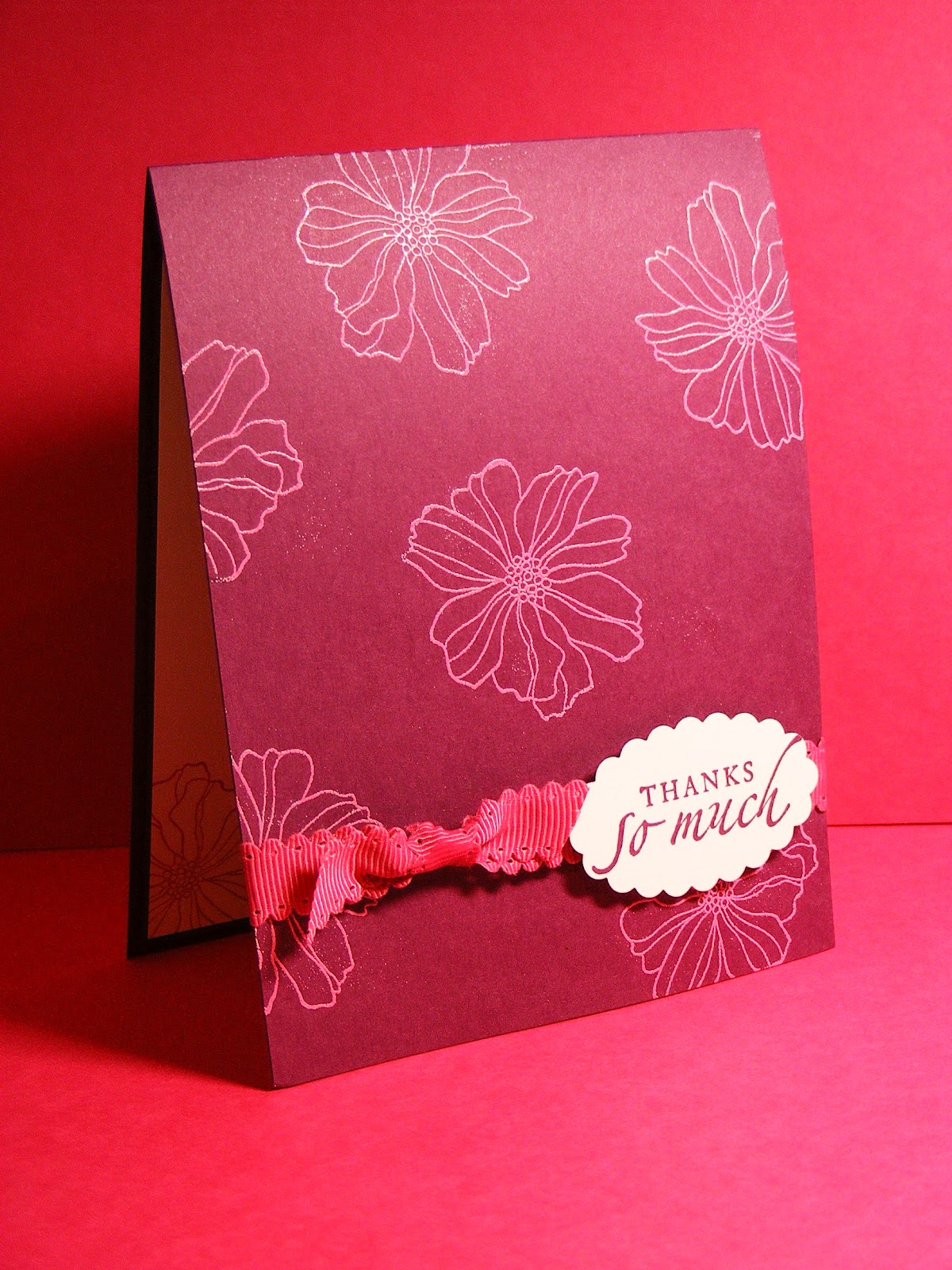
Now, on to some stamping!  One of the items that is disappearing on June 1st is the butterfly punch.  I can't say that I was surprised after seeing that all of the coordinating stamp sets are also retiring.  That said, I will miss that punch!  In honour of it and the retiring Fine Flourish A La Carte stamp, I created this card:

CAS card featuring the Fine Flourish stamp and my homemade butterfly texture plate.
This is one of the simpler cards I've ever done, I think.  To emboss the butterflies I used my home made texture plate.  To learn how to make your own click HERE (scroll down to find the tutorial).  To stamp the butterfly I punched out a butterfly from a self-adhesive note and used it as a mask to stamp the Fine Flourish image in island indigo and then sponge in pool party.  I added a bit of pool party seam binding, layered the indigo ruffled ribbon over top and added an indigo brad.  I decided to omit the sentiment in order to keep the focus on the pretty butterfly. 
Just so you know, the items you need to use a home made texture plate are also retiring: the Standard Texturz Impressions Pad (item # 114614) and the Standard Texturz silicone Rubber (item # 114615).  If you think you might like to try making your own embossing plate, you should consider picking up both of these items before they're gone for good. 

LOTS of Retiring products!


The retiring accessories list has posted and boy, oh boy, are there some questions being asked!  Firstly, to view the list click HERE.  Then, when you are panicking about all the retiring ink pads, markers and cardstock, check out the Retiring Products FAQ tab at the top of this page.  It will calm your fears and explain much of what is on the list.
That said, there are lots of great deals to be had!  Many products are being offered at a discount...some up to 70% off!  Keep in mind that all products on the list are only available while supplies last, so if there are things you just HAVE to have, order them soon!

Tuesday, April 24, 2012

Farewell to Fifth Avenue

Today's post is another in my series of Fond Farewells.  This time we're bidding adieu to Fifth Avenue Floral.  This was the very FIRST stamp set I ever bought.  I purchased it to use for my brother's wedding invitations, which I volunteered to make after having tried stamping for all of 10 minutes!  I had no idea what I was getting myself into!  Suffice to say this stamp set has been VERY well used!  The design for this card was inspired by a contest winner in a recent issue of Stampin' Success, our demonstrator magazine.  Check this out...

Simple Thank you card featuring the Fifth Avenue Floral stamp set and sentiment from Sincere Salutations
Pretty simple, eh?  This card took me less than 10 minutes to create.  I started with the rich razzleberry card base and then stamped the flower image in Versamark.  I then heat embossed the images using melon mambo embossing powder.  I added a bit of ribbon, the sentiment, stamped in rich razzleberry ink and viola...quick and easy card.  Of course, I couldn't resist doing a little something on the inside, so I stamped the same floral image in melon mambo ink on a piece of whisper white cardstock and adhered it inside the card.  Although this stamp set will disappear from the catalogue come June 1st, it is one I will most certainly keep in my stash...it's just too pretty to let go!

Sunday, April 22, 2012

The first set I ordered...

...when the current Idea Book and Catalogue was released last summer was actually a hostess set called Faith in Nature.  There was just something about the images that spoke to me and it was first on my list.  As we near the end of the life of this catalogue, we prepare to say good-bye to all of the wonderful hostess sets, this one included.  Today's post features one of the beautiful images from that set...
Thank you card featuring the Faith in Nature hostess set.  Sentiment is from Just Believe
Another product that will likely disappear with the new catalogue is the Mocha Morning DSP (though we won't know for sure until the Retiring Accessories list posts next week!).  I have to say I just love that paper!  The neutral palette and elegant patterns are so versatile!  I used it on this card as both the background layer and for the scalloped layer as well.  I think I may just have to stock up on that stuff before it goes away!
As for how to put this card together, the only part you likely can't see in the photo is the focal image.  I heat embossed it on watercolour paper, using gold embossing powder, and then coloured it using my aquapainter and more mustard, cherry cobbler and lucky limeade ink pads.  So fast and easy!   The other layers are more mustard and soft suede.  Hope you have a happy Sunday!

Friday, April 20, 2012

A Fond Farewell...

The publication of the Retiring Stamps list is always bittersweet.  There is sadness to see some favourite stamp sets go, but also excitement as we wait to see what will replace them in the new catalogue.  Over the coming days I will feature projects that use some of my favourite retiring sets as my final farewell to them.  Today's project features two retiring A La Carte stamps:  Fine Flourish and Ornate Blossom, as well as the Sincere Salutations sentiment set, which is also retiring.  It also uses a cool technique:  emboss resist.  Have a look...

Multi-occasion card featuring Fine Flourish and Ornate Blossom A La Carte stamps with sentiment from Sincere Salutations

This design would work for  a weddding, anniversary, birthday...any other ideas?
I originally designed this card for a techniques class and then decided to go in another direction.  I don't often make square cards because of the additional postage costs, however, it is fun to work with a different shape now and again.  For those of you who are unfamiliar with the emboss resist technique, here is a quick how-to:
Starting  with a square of whisper white card stock, I stamped the Fine Flourish image using concord crush ink.  I then inked the Ornate Blossom with Versamark and stamped it right over top of the first image, taking care to try to centre it.  I then heat embossed the blossom using clear embossing powder.  Then I inked up my  brayer with concord crush ink and covered the entire square with ink.  The embossed image  will resist the ink and the stamped image underneath will show through.  The final touch is to wipe any excess ink off of the embossed image using a tissue.  Simple, yet elegant. 
Another retiring set I'll miss a lot is Sincere Salutations:
Sincere Salutations (Item # 115068)

Such a versatile set with pretty fonts.  If this little gem isn't yet in your stamp collection you need to order it before May 31st or you'll  miss the chance for good.

Related Posts Plugin for WordPress, Blogger...