The new catalogue preview and pre-order starts tonight at midnight Mountain Time for Stampin' Up! demonstrators!! This is definitely one of the best perks of being a demo...I absolutely can't wait to see what fantastic new goodies are in store for us! The best part is that if I get my pre-order in early I can expedite it and get my copy of the WHOLE catalogue by Friday!! Even though it won't go live until July 1st, there is plenty to be excited about. I don't think I'll be able to sleep tonight...even if I wanted to!
The other big news tomorrow is the Last Chance lists...these are the lists of products that are retiring at the end of June. There will be two lists: one for accessories and one for stamps. The accessories list will be while supplies last only...that means that if there is something on it that you really want, you need to order it ASAP to ensure it doesn't sell out before you get your hands on it. This includes items like DSP, Stampin' Around Wheels, ribbon and Defintiely Decorative. By the way, Stampin' Up is reducing it's Definitely Decorative line, so there will be several items on the last chance list. Don't miss the chance to get some gorgeous vinyl wall art before its gone. The retiring stamp sets will be available until June 30th. Because SU makes their own stamps, they can control inventories and ensure that all orders are filled until the end of the month.
The best way to order anything from the Last Chance list is to do so through my online store. Stampin' Up will be updating the availability constantly so you can be assured that you will get the items you order. Once something is sold out it will be removed from the website. Click on the shopping cart in the sidebar to get started!
This is such an exciting time of year...like Christmas...but better!! Only a few more hours...

Sharing my love of all things paper.
Tuesday, May 31, 2011
Monday, May 30, 2011
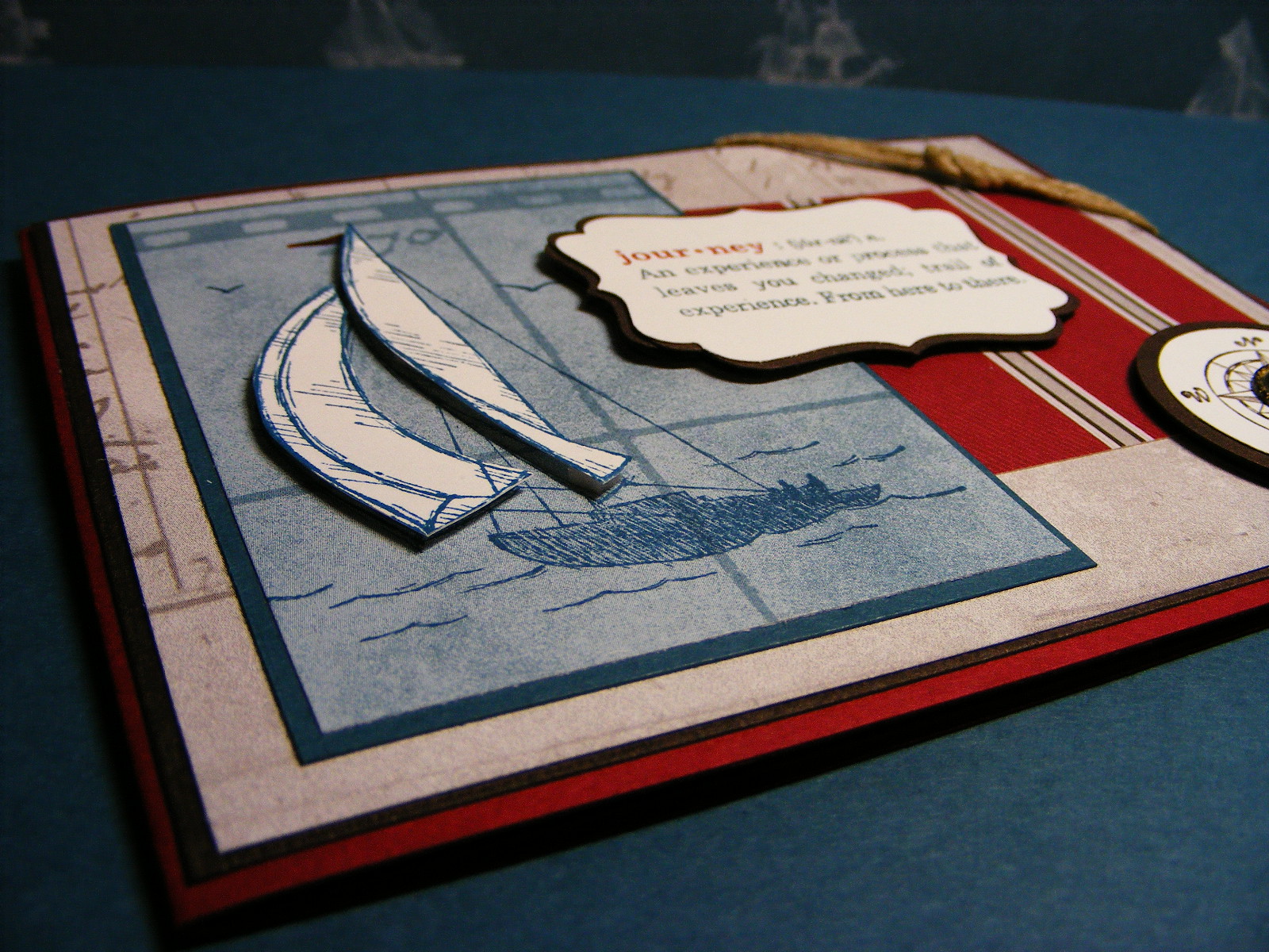
Another Nautical-inspired card
Today's card is another one I did based on this week's A La Card Monkey sketch. It is far less vintage than my guest designer submission, but still definitely has that maritime influence. It also works for this week's Pals Paper Arts challenge which is to create a card that uses brads. This one certainly does and I really think they provide the perfect finishing accent. See what you think:
So this card started out as the monkey sketch and then morphed a little. The focal image was too big to fit the sentiment underneath, so I moved it up to the side. That left too much empty space under the sentiment so that is where those nifty brads came in. Then I heard my baker's twine calling out to me, feeling unloved and neglected and so I added a little...not in the sketch, but I like it. Call it artistic licence...
This card is pretty simple in terms of composition, but I will explain how I did the focal image. Starting with a piece of whisper white cardstock, I sponged the sky in marina mist ink and the sea in not quite navy. I then stamped the image in basic gray once on the sponged piece and a second time on another scrap of whisper white. I fussy cut out the sails and adhered them to the stamped image using dimensionals. I then added whitecaps to the waves using my white gel pen. A simple touch, but one that adds interest to the scene.
I'm pretty sure you savy stampers can figure out the rest...if not drop me a line and I'll answer your questions. Off to do course work now...ugh!!
 |
| Nautical Card for PPA95 and MC58 using Sail Away a la carte stamp from the Summer Mini |
 |
| Close up of the focal image |
 |
| Inside of card |
This card is pretty simple in terms of composition, but I will explain how I did the focal image. Starting with a piece of whisper white cardstock, I sponged the sky in marina mist ink and the sea in not quite navy. I then stamped the image in basic gray once on the sponged piece and a second time on another scrap of whisper white. I fussy cut out the sails and adhered them to the stamped image using dimensionals. I then added whitecaps to the waves using my white gel pen. A simple touch, but one that adds interest to the scene.
I'm pretty sure you savy stampers can figure out the rest...if not drop me a line and I'll answer your questions. Off to do course work now...ugh!!
Sunday, May 29, 2011
On the Grow
This weekend has absolutley flown by! I've spent the better part of it working on my course. Talk about time-consuming!! I so would rather be stamping!! I did manage to get a little inking in and worked on my card for this week's challenge over at Friday Mash-up. Conveniently it also works for thee challenge over at Just add Ink which is all about Fussy Cutting. Check it out:
 Here is my card:
I have to admit...I found this sketch tough to work with. I had a hard time getting all of the different elements to work together. In the end, I'm happy with the result, but it wasn't easy getting here! Here is what I did:
Starting with a Night of Navy card base, I adhered a piece of pear pizzazz DSP (from the level one hostess stack) as well as a strip of pear pizzazz cardstock I had embossed with my Finial Press embossing folder. I then wrapped a piece of pretty in pink taffeta ribbon around and tied a bow. I punched a narrow strip of pretty in pink DSP (from the Subtles Stack) with my eyelet border punch and adhered it along the bottom edge of the card. Setting this aside, I stamped the floral image from the On The Grow set in brown Staz-On in a piece of confetti white cardstock and then punched it out using my 2 1/2" circle punch. I coloured the image using a blender pen and my night of navy, pear pizzazz and pretty in pink ink pads. I then inked the glass bottle using my Versamarker and embossed it using clear embossing powder. On another scrap of confetti white cardstock, I then stamped the image a second time and coloured select blossoms which I fussy cut. I adhered the fussy-cut blossoms to the original stamped image using bits of dimensionals. I added tiny dots of Tombow liquid adhesive to the centres of each blossom and sprinkled them with Dazzling Diamonds glitter. To create the eyelet border around the circle I punched another strip of pretty in pink DSP with my eyelet border punch and then cut each scallop. I adhered each section individually around the circle using glue dots, ensuring each section was evenly spaced. I glued the focal image to my card using Tombow. The final touches were the sentiment (from Pocket Silhouettes set) which I stamped in night of navy ink on confetti white cardstock and punched out with my curly label punch. I tucked it underneath the embossed pear pizzazz strip and adhered it. I added a little string of pearls in the upper right corner, as per the sketch. I think they add a nice, feminine touch.

 |
| Card for MU8 and JAI69 using On the Grow stamp set from the Summer Mini. |
 |
| Close up of focal image |
 |
| Trying to show you the popped up flowers! |
I have to admit...I found this sketch tough to work with. I had a hard time getting all of the different elements to work together. In the end, I'm happy with the result, but it wasn't easy getting here! Here is what I did:
Starting with a Night of Navy card base, I adhered a piece of pear pizzazz DSP (from the level one hostess stack) as well as a strip of pear pizzazz cardstock I had embossed with my Finial Press embossing folder. I then wrapped a piece of pretty in pink taffeta ribbon around and tied a bow. I punched a narrow strip of pretty in pink DSP (from the Subtles Stack) with my eyelet border punch and adhered it along the bottom edge of the card. Setting this aside, I stamped the floral image from the On The Grow set in brown Staz-On in a piece of confetti white cardstock and then punched it out using my 2 1/2" circle punch. I coloured the image using a blender pen and my night of navy, pear pizzazz and pretty in pink ink pads. I then inked the glass bottle using my Versamarker and embossed it using clear embossing powder. On another scrap of confetti white cardstock, I then stamped the image a second time and coloured select blossoms which I fussy cut. I adhered the fussy-cut blossoms to the original stamped image using bits of dimensionals. I added tiny dots of Tombow liquid adhesive to the centres of each blossom and sprinkled them with Dazzling Diamonds glitter. To create the eyelet border around the circle I punched another strip of pretty in pink DSP with my eyelet border punch and then cut each scallop. I adhered each section individually around the circle using glue dots, ensuring each section was evenly spaced. I glued the focal image to my card using Tombow. The final touches were the sentiment (from Pocket Silhouettes set) which I stamped in night of navy ink on confetti white cardstock and punched out with my curly label punch. I tucked it underneath the embossed pear pizzazz strip and adhered it. I added a little string of pearls in the upper right corner, as per the sketch. I think they add a nice, feminine touch.
Saturday, May 28, 2011
Nautical Man-Card for A La Card Monkey
I'm a guest designed over at A La Card Monkey again this week! The challenge is to create a Man-Card using the sketch provided:

It seems I've had to do a lot of Manly cards over the last couple of weeks and it has been a reminder that I am sadly lacking in my masculine stamp selection! I can't wait for the new catty to come out so I can get shopping!! In the meantime, I've used my fav set from the Summer Mini: The Open Sea, along with the Nautical Expedition DSP. See what you think:
I went a little hog-wild distressing this one! I wanted it to look worn and weathered...I think I succeeded! I also discovered a new technique I'm calling "Faux Wax Seal". I'm sure I'm not the first to come up with this, but I was pretty pleased with the result! To get the look, start by pre-inking your stamp with Versamark...this is an important step! Setting the stamp aside, pour a small pile of embossing powder on your cardstock in the location you want your seal. Spread out the powder so that it is even and then heat it FROM THE UNDERSIDE with your heat tool until the powder melts into a pool. It will start to bubble, so stop when this happens. Then immediately stamp your image into the pool of melted powder, holding it there for a few seconds to allow the pool to harden. Gently peel your stamp away and voila...instant "wax" seal! A couple of tips for this technique...make sure your pile of embossing powder is even and not too thick. You want as uniform a depth as possible. If you use too much powder, the pool will be too deep and you'll get a messy image. It took me a couple of tries on some scrap paper to get the amount of powder right. Just play and experiment until you get something you're happy with. It's worth the effort...I really like the look!

It seems I've had to do a lot of Manly cards over the last couple of weeks and it has been a reminder that I am sadly lacking in my masculine stamp selection! I can't wait for the new catty to come out so I can get shopping!! In the meantime, I've used my fav set from the Summer Mini: The Open Sea, along with the Nautical Expedition DSP. See what you think:
 |
| Card for Monkey58 using The Open Sea set and sentiment from Define Your Life set. |
Friday, May 27, 2011
Sick...AGAIN!!!
...and here I thought with the coming of spring I'd be saying good-bye and good riddance to the cold and flu bugs that have been plaguing our household all winter. WRONG!! Half of my students at school are sick and, what they get, I inevitably get. How could I not? They blow their germs at me every time the play their instruments! I am feeling quite lousy this evening and will post something more fun tomorrow. For now I am taking some quality drugs and heading off to bed! TGIF...
Thursday, May 26, 2011
His and Hers Baby cards
I have babies on the brain these days! My brother and SIL are expecting in early September and every time we see them the conversation inevitably turns to babies. They were here on the weekend to babysit so my DH and I could have a date night and we got talking about the PILES of baby gear they are going to inherit from us. We also discussed how terribly inconsiderate it is of them to keep us in suspense as to the baby's gender...they are making us wait till s/he arrives! So, I decided to make two baby cards...one for a boy and one for a girl. I initially set out to make possible samples for my upcoming Stamp-A-Stack...and who knows, maybe these will crack the line-up. I got the idea for the focal image from the Stampin' Up catalogue but then had to add more embellishments...because...well...just because! See what you think...
I kept these cards fairly simple, since I was trying to come up with SAS designs. I didn't want anything too involved, or my stampers would be here all day! I actually did the boy card first and decided to try stamping off some of the crumb cake images to make it a bit softer for a girl. I like the look and kind of wished I had done the same on the boy card too! I will make the suggestion to my stampers if we end up doing these ones!
 |
| Baby Girl card using Fox and Friends stamp set and sentiment from Teeny Tiny Wishes. |
 |
| Baby Boy card...same everything...except using baja breeze instead of pretty in pink! |
Wednesday, May 25, 2011
Summer Splash for The Paper Players
A while back I did a card for a colour inspiration challenge over at Stamping 411. I really liked the combo and today's card uses two of the three colours from it. The sketch for this week's challenge at the Paper Players is a REALLY versatile one...so much so that I am sure I will use it again and again. It lends itself so well to so many different themes. My first thought was of the Summer Splash set and what I could put in those little circles...but before I get ahead of myself, here is the sketch:
 ...and here is my card using the Summer Splash set from the Summer Mini:
Isn't this a fun, summery card? I wanted to keep it as simple as possible, given the simplicity of the sketch. You likely know by now that simple is a REAL challenge for me! My name is Leena and I am an embellishment addict! But look ma, NO EMBELLIES!! Just stamps, ink and paper...not something I generally do! I did do a little funky punching with my scallop circle to create the sun...really simple and easy to do. I just punched a scalloped circle, stuck it to a post-it note and then reinserted into my punch, offsetting the scallops, and repunched. Voila...instant sun! This isn't my idea...I stole it from my upline, Jamilla (thanks Jam!). The sand is courtesy of my spritzer tool...LOVE that thing...how did I live without it for so long?!? I spritzed the crumb cake cardstock with crumb cake, soft suede and chocolate chip ink to get the textured look. I then sponged it lightly with crumb cake to blend the colours...kinda makes you want to touch it, no?
The sentiment is from the Sunny fun set and just worked perfectly for this card. I left the inside blank and will likely stamp something when I'm ready to use this card...for a summer birthday, thank you, invitation, whatever. I had to include the little shovel and pail because they remind me of my son and the hours he spends in his sandbox!
 |
| Card for PP48 using Summer Splash stamp set with sentiment from Sunny Fun set. |
 |
| Inside of card sans sentiment! |
The sentiment is from the Sunny fun set and just worked perfectly for this card. I left the inside blank and will likely stamp something when I'm ready to use this card...for a summer birthday, thank you, invitation, whatever. I had to include the little shovel and pail because they remind me of my son and the hours he spends in his sandbox!
Tuesday, May 24, 2011
Birthday Card for Colton
My son's best friend, Colton, is having a birthday this week and Max is SO excited. The party is at Chuck E Cheese...enough said. Colton is a sweet little boy who is having a tough go of it this year. He lost his nanny in September and now his parents are splitting up...a lot for a 4-year-old to handle. When last we saw Colton at Max's birthday party, he seemed so sad it almost broke my heart. So I set out to make him an extra-special birthday card. Conveniently, the challenge for this week over at A La Card Monkey is a birthday+sketch:
 Here is my fun birthday card for Colton:
Isn't this fun?!? I had a blast making this card! I've had the sweet treat cups sitting around for ages and finally was inspired to try using them! I am so pleased with the way this turned out...I sure hope it will put a smile on the birthday boy's face too!

 |
| Card for Monkey57 using Sweet Treats set and the sweet treat cups. |
 |
| Close up of the sentiment from Flight of the Butterfly set |
 |
| Inside of card |
Monday, May 23, 2011
Love and Care for PPA
Well...it seems the long weekend is over...hard to believe! Why does time off go by so much faster than time at work?!? The past three days have flown by...but then I've been mighty busy! The weather was better than forecasted and so I got a lot of gardening and yard work done. Our backyard is still a swamp from all the rain we've had, but I did manage to get my patio pots planted and it looks great! Now for a little patio weather and we could actually say summer is on it's way! In addition to all the yard work, I made some headway on my course and still found a little time to stamp. After being buried in assignments on the computer, getting down to my stampin' corner to put ink to paper is like a breath of fresh air! The card I have for you today is inspired by the Stamping 411 colour inspiration for this week: always artichoke, river rock and rose red. Now those three colours are not ones I would typically put together, but I am actually quite happy with the result. The layout for this card is from this week's Pals Paper Arts sketch:


Here is my card:
 |
| Card for PPA 94 using Love and Care level 2 hostess set. |
 |
| Close up of focal images and vellum butterflies |
 |
| Inside of card |
You may be wondering when my love affair with this stamp set will end...keep wondering! I just love the softness of the images and am having fun playing with them. This card really just sort of came together because of the images I was using. Here is how I put it together:
Starting with a river rock card base, I ran it through my Big Shot with the vintage wallpaper embossing folder. I sponged the edges of the card base with river rock ink. Setting that aside, I stamped the stem image randomly on a strip of always artichoke cardstock using ink of the same colour. All the images were stamped off once to keep the background subtle. I sponged all the edges in always artichoke ink. I then punched a strip of rose red cardstock using my dotted scalloped ribbon punch. I cut it to 5 1/2" and then adhered it to the top edge of the artichoke strip. I then took a piece of rose red seam binding ribbon and pulled the threads to gather it. I adhered it along the bottom edge of the artichoke piece. I then adhered the whole thing to the prepared card base. For the focal images, I stamped the stems in river rock, both full strength and stamped off, the flower in rose red, stamped off and the leaf in always artichoke stamped off. I stamped the images randomly all over a scrap of very vanilla textured cardstock and then punched out three 1 3/8" circles. I sponged the edges of all the circles and then layered them each on a 1 3/4" scalloped circle punched out of rose red cardstock. For added interest, I notched every other scallop with my paper snips. I adhered the circles to the card using dimensionals. The final touch was the butterflies that I cut from vellum paper using my beautiful wings embosslit and my Big Shot. I sponged them lightly in rose red ink and then adhered them using glue dots. I added some little pearls to each one.
You may be wondering where the sentiment is!! The answer is that I left it off. I made this card with the intent of sending it to a colleague who is recovering from back surgery. I thought the simple "Take Care" on the inside would suffice. Speaking of the inside, it is pretty easy to figure out what I did. The sentiment is stamped in always artichoke, full strength on a scrap of the leftover images from the front. I punched it out with my large oval punch and layered it on a scalloped oval. I again notched every other scallop. The rest you can figure out from the photos.
I can't wait for you to see the card I have for you tomorrow! I made it for my son's friend who is having a birthday party this week. It is such fun...stay tuned!!
Sunday, May 22, 2011
Baby Bling
Today's card is another twofer...I combined two challenges in one card. The layout is based on the sketch challenge over at Mojo Monday and the second is the inspiration challenge over at Friday Mashup. Here is the sketch and the inspiration photo:


When I was deciding what DSP to use for my background, I immediately thought of the retired Sending Love DSP from last year's Occasions Mini. This paper has such pretty, girlie patterns as well as some bling, so I thought it would work well for the challenge. The focal image involved a whole lot of masking and watercolouring, using my ink pads and aquapainter. I added the tiniest little pearls to the carriage (this little one is a princess in training) as well as to the sentiment. I also added a little extra lace to make it even girlier. I really hope my colleague likes this...it took a LONG time to put together!


The decided to do a card for a baby girl. A colleague of mine at work just had a beautiful little girl after years of fertility treatments and failed attempts. I wanted to make something special for her and thought this would fit the bill!
 |
| Bling Baby! Girl card for Mojo Monday 191 and MU7 using the Baby Bundle set as well as the sentiment from the retired Lovely Label set. |
 |
| Sentiment from Lovely Labels (retired) |
 |
| Inside sentiment from Baby Bundle set |
Friday, May 20, 2011
Sail Away...
Well the long Victoria Day weekend is finally here. The first long weekend of the season...kick off to the summer...May two-four. There are many reasons to enjoy this weekend, but for me it will simply be a chance to get caught up on some gardening, some stamping and this infernal course I am taking. As three whole days stretch ahead of me, I am a little unsure where to start tackling my To-do list, so I figured I'd relax with a little stamp-therapy. Its been almost a week since I put ink to paper and I needed a while to get the mojo working. Thankfully, there is the summer mini and the great nautical paper and stamps to inspire me. Conveniently the challenge this week over at The Paper Players is a colour one that uses the three colours in the Nautical Expedition DSP:
 So, here is my nautical card...even though I don't have a sea-worthy bone in my body!
I wasn't kidding when I said I wasn't sea-worthy. Boats make me sick...literally. All I have to do is look at a boat bobbing on the waves and I turn green. But I love this suite of new products! There is something about the DSP and stamp images that just appeals to me and inspires my creativity. This card is really straightforward...nothing tricky or special here! At the end of a long, busy week, I don't feel much like doing a play-by-play how-to on this one...I hope you don't mind! If you are stumped by anything, leave a comment and I'll try to help you out. In the meantime, I'm going to enjoy my Friday evening...I hope you do too!

 |
| Card for PP46 using the Sail Away a la carte stamp, and The Open Sea set and Define Your Life sets. |
 |
| Trying to show the popped up, paper-pieced sails |
 |
| My attempt at a nautical-looking knot! |
 |
| Inside of card with sentiment from the Word Play set. |
Tuesday, May 17, 2011
A Two-fer...
Today I kind of cheated in a couple of ways. First of all, my card uses a bunch of retired product...sorry...but I love the images and they were perfect for what I wanted to do. Secondly, I combined two challenges in this one card! Stamping 411 has a sketch challenge this week and Friday Mashup is all about monochromatic manly cards so....I convered 'em both in one card! As most of you know, I'm taking an online course for work and as a result, my stamping time is pretty limited these days. I need to economize and make the most of the few minutes I have, hence the two-for one card. Now...enough justifying! Here are the challenges:


Here is my card for both of these challenges:
Here is how I put this one together. Starting with a 4" x 5 1/4" piece of the grid patterned Presto Patterns specialty paper, I spritzed it using my basic gray and basic black markers and my spritzer tool. I set it aside to dry and then took a 3" x 3 1/4" piece of whisper white and stamped the various bicycle images from the Pedaling Past set in going gray (retired), basic gray and basic black ink. Some images I stamped off once to get variety in the shades of gray. I then sponged the whole thing lightly with going gray (I miss that colour!) and the edges only in basic gray. I then stamped the motorcycle in Versamark ink and then heat embossed it using black embossing powder. I stamped the sentiment in the lower right corner using basic gray ink and then adhered the stamped piece to a mat in brushed silver cut 1/8" larger in size. That was then adhered to a second mat (the layer queen strikes again!) in basic black cut 1/8" larger than the silver piece. Turning my attention back to the background piece, I sponged the entire thing lightly in going gray ink to bring out the grid pattern and then sponged the edges in basic black. I then wrapped a length of black hemp twine (also retired) around it lengthwise several times, tying it in a knot. I added a trinket key, also securing it with a knot. I adhered the stamped image using dimensionals. The final element is the three silver brads in the upper right corner, as per the sketch. I glued the whole cardfront to a basic gray card base. The inside is pretty self-evident...I think you can likely figure it out...nothing fancy there!
Can you see why I just had to use so much retired product for this card? I know it can be frustrating to go blog surfing and see something great that uses product you can't get anymore...so I apologize...and I'm willing to share! If you live close-by you are more than welcome to borrow my stamps!


Here is my card for both of these challenges:
 |
| Card for MU6 and SSC203 using Pedaling Past set and Motorcycle a la carte stamp (both are retired but the motorcycle is available as an MDS digital download!) |
 |
| Close up of all the elements in the card! |
 |
| Inside of card...sentiment is from Teeny Tiny Wishes set (if you don't have this set yet, you NEED it!) |
Here is how I put this one together. Starting with a 4" x 5 1/4" piece of the grid patterned Presto Patterns specialty paper, I spritzed it using my basic gray and basic black markers and my spritzer tool. I set it aside to dry and then took a 3" x 3 1/4" piece of whisper white and stamped the various bicycle images from the Pedaling Past set in going gray (retired), basic gray and basic black ink. Some images I stamped off once to get variety in the shades of gray. I then sponged the whole thing lightly with going gray (I miss that colour!) and the edges only in basic gray. I then stamped the motorcycle in Versamark ink and then heat embossed it using black embossing powder. I stamped the sentiment in the lower right corner using basic gray ink and then adhered the stamped piece to a mat in brushed silver cut 1/8" larger in size. That was then adhered to a second mat (the layer queen strikes again!) in basic black cut 1/8" larger than the silver piece. Turning my attention back to the background piece, I sponged the entire thing lightly in going gray ink to bring out the grid pattern and then sponged the edges in basic black. I then wrapped a length of black hemp twine (also retired) around it lengthwise several times, tying it in a knot. I added a trinket key, also securing it with a knot. I adhered the stamped image using dimensionals. The final element is the three silver brads in the upper right corner, as per the sketch. I glued the whole cardfront to a basic gray card base. The inside is pretty self-evident...I think you can likely figure it out...nothing fancy there!
Can you see why I just had to use so much retired product for this card? I know it can be frustrating to go blog surfing and see something great that uses product you can't get anymore...so I apologize...and I'm willing to share! If you live close-by you are more than welcome to borrow my stamps!
Monday, May 16, 2011
Rockin' Birthday card
I was excited when I saw this week's challenge at A La Card Monkey. I loved the sketch because it is so versatile and easy to use and the theme of a kid card was perfect! I've been wanting a reason to crack out my Grunge Rock set that I just got on sale for 30% off as part of Stampin' Up's National Scrapbooking Month promotion. I decided to do a birthday card for a tween boy...but first, here's the sketch:

I wanted something bright and colourful and fun...here is what I came up with:
Fun, eh? I had a great time with this card! You know when something just comes together exactly the way you picture it in your head? That's what happened with this. So here is what I did...
I started by cutting a 3" circle in whisper white cardstock and a 3 1/4" circle in real red using my Circle Scissors Plus (yet another item that has sat unloved for AGES!). I then inked the splatter image from the Extreme Elements set in baja breeze and then sponged real red around the outer edges before stamping it on my white circle. I then stamped the stars in pumpkin pie, the diamonds in pear pizzazz and the guitar player in chocolate chip. I distressed the edges and then sponged then with chocolate chip ink. I layered it over the real red circle, which I had also distressed using the tool from my cutter kit. Setting this aside, I cut a 4" x 5 1/4" piece of the psychedelic chevron pattern from the Greenhouse Gala DSP pack. I distressed and sponged the edges again in chocolate chip. I then took a 2 1/4" piece of baja breeze cardstock, ran it through my Big Shot with the harlequin texture plate and then distress and sponged the edges. I also lightly sponged the embossing to bring out the pattern. I adhered the baja breeze piece to the DSP and then adhered the whole thing to a real red mat 4 1/8" x 5 3/8" in size. Wanting to use the ribbon element in the sketch but not wanting anything froo-froo, I wrapped some baker's twine around the cardfront several times, tying a knot slightly off-centre. I added the trinket crown, tying it on with the twine. I then adhered the entire caardfront to base in chocolate chip. The final element on the front is the stamped crown image, which I stamped in baja breeze ink on whisper white. I punched it out with my 1 1/4" circle punch. I distressed and inked the edges in chocolate chip. I layered it on a 1 3/8" circle that I had also distressed and inked. I adhered it to the card using dimensionals.
For the inside, I cut a 4" x 5 1/4" piece of whisper white, stamped the diamond image in baja breeze, the stars in pumpkin pie (stamped off once), and the guitar in chocolate chip; all in the lower right corner. I inked the edges in chocolate chip and adhered it inside the card. I then cut out a strip of the chevron DSP and adhered it. I stamped the sentiment, some stars and some diamonds on a scrap of whisper white, notched the ends and distressed and inked the edges. I rolled the ends slightly around a pencil to make them curl and then adhered the sentiment over the chevron strip.
Now if only I had someone in my life of an age to appreciate this card! I may have to save it until my son gets a bit older!

I wanted something bright and colourful and fun...here is what I came up with:
 |
| Card for Monkey Challenge #56 using Extreme Elements, Grunge Rock and Extreme Guitar sets |
 |
| Close up of focal image...believe it or not, this is the first time I've used my Extreme Elements set! I loved, bought it and haven't inked it up till now! I know...shame on me! |
 |
| Inside of card |
I started by cutting a 3" circle in whisper white cardstock and a 3 1/4" circle in real red using my Circle Scissors Plus (yet another item that has sat unloved for AGES!). I then inked the splatter image from the Extreme Elements set in baja breeze and then sponged real red around the outer edges before stamping it on my white circle. I then stamped the stars in pumpkin pie, the diamonds in pear pizzazz and the guitar player in chocolate chip. I distressed the edges and then sponged then with chocolate chip ink. I layered it over the real red circle, which I had also distressed using the tool from my cutter kit. Setting this aside, I cut a 4" x 5 1/4" piece of the psychedelic chevron pattern from the Greenhouse Gala DSP pack. I distressed and sponged the edges again in chocolate chip. I then took a 2 1/4" piece of baja breeze cardstock, ran it through my Big Shot with the harlequin texture plate and then distress and sponged the edges. I also lightly sponged the embossing to bring out the pattern. I adhered the baja breeze piece to the DSP and then adhered the whole thing to a real red mat 4 1/8" x 5 3/8" in size. Wanting to use the ribbon element in the sketch but not wanting anything froo-froo, I wrapped some baker's twine around the cardfront several times, tying a knot slightly off-centre. I added the trinket crown, tying it on with the twine. I then adhered the entire caardfront to base in chocolate chip. The final element on the front is the stamped crown image, which I stamped in baja breeze ink on whisper white. I punched it out with my 1 1/4" circle punch. I distressed and inked the edges in chocolate chip. I layered it on a 1 3/8" circle that I had also distressed and inked. I adhered it to the card using dimensionals.
For the inside, I cut a 4" x 5 1/4" piece of whisper white, stamped the diamond image in baja breeze, the stars in pumpkin pie (stamped off once), and the guitar in chocolate chip; all in the lower right corner. I inked the edges in chocolate chip and adhered it inside the card. I then cut out a strip of the chevron DSP and adhered it. I stamped the sentiment, some stars and some diamonds on a scrap of whisper white, notched the ends and distressed and inked the edges. I rolled the ends slightly around a pencil to make them curl and then adhered the sentiment over the chevron strip.
Now if only I had someone in my life of an age to appreciate this card! I may have to save it until my son gets a bit older!
Sunday, May 15, 2011
A Bridal Card for PPA93
Ok...I went a little over-the-top for with my card for this weeks Pals Paper Arts Challenge! I just couldn't resist! Check out this inspiration photo:

Is that not GORGEOUS?!? I love the soft, muted colours and the lace, so...here is my way-out-of-my-comfort-zone card:
So...whaddaya think? Over the top, right? I just couldn't resist going above and beyond with this beautiful inspiration photo. I drew my colours from the photo: sahara sand, blushing bride and always artichoke (and whisper white, of course!) Here is how I put this together...I'm sure it will be faster to explain than to make!
Starting with a 4 5/8" square piece of Bride specialty paper (retired), I sponged the edges in blushing bride ink and then lightly in sahara sand. I layered that on a 4 3/4" square piece of blushing bride cardstock and then adhered both pieces to a 5" square card base in textured sahara sand cardstock. Setting that aside, I turned to making the flower. Using my build-a-blosom punch, I punched several of the largest petal and the smaller, same-shaped petal from whisper white cardstock. I then ran them all through my crimper several times and crumpled them until they started to separate. I carefully pulled them apart, creating felted-paper petals. I then sponged each petal lightly with sahara sand and blushing bride inks. Using one of the big designer buttons in river rock (the closest I had to sahara sand), I began gluing the petals to the backside of the button, beginning with the smaller-sized ones and then moving to the larger ones. Once I had all my petals glued on, I crumpled the flower in my hand to give it more shape and dimenion. I then punched several ornaments in sahara sand, distressed and pulled them apart as I did my petals, and sponged them lightly with always artichoke ink. I shaped them into petals and glued them to my flower using Tombow liquid glue. I then cut several short lengths of Victoria lace trim, looped them and glued them to the back of my flower using glue dots. The final touch was the pearls...lots of 'em...stuck to the button so that it was completely covered. I also layered some underneath the button to give the centre of the flower a more 3-D effect. Some of them are adhered with Crystal Effects to ensure they don't fall off! I adhered the flower to my card using Tombow liquid glue. I stamped the sentiment from the Occasional Quotes set in Versamark and then heat embossed it using gold glory (retired) embossing powder. I punched it out using my decorative label punch and then layered it on a second decorative label in blushing bride. I trimmed the top portion off and then adhered it to my card.
I don't know if I will actually ever give this to someone because I don't think it would fit in an envelope...but I sure had fun making it!

Is that not GORGEOUS?!? I love the soft, muted colours and the lace, so...here is my way-out-of-my-comfort-zone card:
 |
| Wedding card for PPA 93 using the Occasional Quotes hostess level 3 set and a whole lotta petals from my build-a-blossom punch (not to mention a pearl or two!) |
 |
| Close up of the flower...this took a while to make!! |
 |
| The leaves are ornament punches in sahara sand and then sponged with always artichoke |
So...whaddaya think? Over the top, right? I just couldn't resist going above and beyond with this beautiful inspiration photo. I drew my colours from the photo: sahara sand, blushing bride and always artichoke (and whisper white, of course!) Here is how I put this together...I'm sure it will be faster to explain than to make!
Starting with a 4 5/8" square piece of Bride specialty paper (retired), I sponged the edges in blushing bride ink and then lightly in sahara sand. I layered that on a 4 3/4" square piece of blushing bride cardstock and then adhered both pieces to a 5" square card base in textured sahara sand cardstock. Setting that aside, I turned to making the flower. Using my build-a-blosom punch, I punched several of the largest petal and the smaller, same-shaped petal from whisper white cardstock. I then ran them all through my crimper several times and crumpled them until they started to separate. I carefully pulled them apart, creating felted-paper petals. I then sponged each petal lightly with sahara sand and blushing bride inks. Using one of the big designer buttons in river rock (the closest I had to sahara sand), I began gluing the petals to the backside of the button, beginning with the smaller-sized ones and then moving to the larger ones. Once I had all my petals glued on, I crumpled the flower in my hand to give it more shape and dimenion. I then punched several ornaments in sahara sand, distressed and pulled them apart as I did my petals, and sponged them lightly with always artichoke ink. I shaped them into petals and glued them to my flower using Tombow liquid glue. I then cut several short lengths of Victoria lace trim, looped them and glued them to the back of my flower using glue dots. The final touch was the pearls...lots of 'em...stuck to the button so that it was completely covered. I also layered some underneath the button to give the centre of the flower a more 3-D effect. Some of them are adhered with Crystal Effects to ensure they don't fall off! I adhered the flower to my card using Tombow liquid glue. I stamped the sentiment from the Occasional Quotes set in Versamark and then heat embossed it using gold glory (retired) embossing powder. I punched it out using my decorative label punch and then layered it on a second decorative label in blushing bride. I trimmed the top portion off and then adhered it to my card.
I don't know if I will actually ever give this to someone because I don't think it would fit in an envelope...but I sure had fun making it!
Saturday, May 14, 2011
Whole Lotta Gratitude
Well, I was more exhausted yesterday than I expected I'd be and didn't get to posting...my apologies! Thursday night was our year-end concert at school. As the head of the music department all of the production details and organization for the concert fell to me which made for a very busy week and little time for much else. Thankfully the show went well and we had lots of happy students and parents. Speaking of parents, there were several who stepped up to help out with various roles the night of the show. From selling tickets to setting out refreshments, their help is invaluable to me, as I am always busy getting students organized, tuned and into place before the show starts. Having a group of reliable parents to shoulder some of the responsibility makes my job much easier. To thank them I designed today's card, in which I will write a note of appreciation and send. See what you think...I hope you like...I made EIGHT!
In designing this card I wanted it to be suitable for either a male or female recipient, as we had both moms and dads helping us out. I also wanted it to have some musical element, for obvious reasons, so I pulled out my retired Elegant Notes set and my current Music Notes wheel. The best part of this card, though, is the double embossed layer shown in the third photo. I have seen this technique used before but never tried it myself and when I saw it in June issue of Stampin' Success (our demonstrator-only magazine) I just knew I had to try it. Here is the how-to:
Choose an embossing folder with a large, bold image. The Vintage Wallpaper one I used here works perfectly. Take your Versamark pad directly to the SMOOTH side of the folder, applying the ink evenly all over it. Lay your DSP (in my case, Love Letters) or cardstock into the folder and run it through the Big Shot. Then sprinkle embossing powder all over the embossed surface, shaking off the excess. You should have powder stuck to all of the non-raised parts of the image. Heat with your heat tool until all the embossing powder has melted. Voila...double delight! A very cool technique that produced, in my case, a vintage-looking layer that was perfect for my card. A big WOW for not a lot of effort.
As for the rest of the card it is pretty straightforward. The ribbon was trimmed and then frayed to create the fringe. The medallion (from Artistic Etchings) was stamped third-generation over top of the sentiment (as was the treble clef on the inside of the card. All of the very vanilla pieces were sponged with crumb cake to age them and make them blend better with the DSP.
Making eight of these took a while. I am really not a big fan of mass-production and am dreading having to make dozens of the same swap cards for convention! I love the creating and design part...the mindless cutting and assembly...not so much.
I really hope this card shows my parent volunteers just how much they are appreciated!
 |
| Thank you card using Elegant Notes (retired) and Artistic Etchings sets. |
 |
| Close up of focal image. |
 |
| Close up of double embossed layer...see below for details...you're going to LOVE this technique! |
 |
| Inside of card using Music Notes wheel and Elegant Notes. |
Choose an embossing folder with a large, bold image. The Vintage Wallpaper one I used here works perfectly. Take your Versamark pad directly to the SMOOTH side of the folder, applying the ink evenly all over it. Lay your DSP (in my case, Love Letters) or cardstock into the folder and run it through the Big Shot. Then sprinkle embossing powder all over the embossed surface, shaking off the excess. You should have powder stuck to all of the non-raised parts of the image. Heat with your heat tool until all the embossing powder has melted. Voila...double delight! A very cool technique that produced, in my case, a vintage-looking layer that was perfect for my card. A big WOW for not a lot of effort.
As for the rest of the card it is pretty straightforward. The ribbon was trimmed and then frayed to create the fringe. The medallion (from Artistic Etchings) was stamped third-generation over top of the sentiment (as was the treble clef on the inside of the card. All of the very vanilla pieces were sponged with crumb cake to age them and make them blend better with the DSP.
Making eight of these took a while. I am really not a big fan of mass-production and am dreading having to make dozens of the same swap cards for convention! I love the creating and design part...the mindless cutting and assembly...not so much.
I really hope this card shows my parent volunteers just how much they are appreciated!
Wednesday, May 11, 2011
Party all week
A while back I posted a card here that used the stamp set "Cheers To You" and featured punch art olives with the martini glass image. Last night I was playing around with my new triple layer punch and came up with an idea for lime wedges. So I pulled out Cheers to You once again and did a fruity drink card using my limes. Here it is...
So, as you can see I CASED my own card for this one! I simply changed up the colours but used the same layout and design. My husband says the limes don't look like limes...he may be right as I look at it now. Oh well...back to the drawing board!
Just a heads' up that I won't be posting tomorrow night. We have our year-end concert at school and since I'm running the show, I won't be home until late. I'll catch up with you all on Friday!
 |
| Fun card using Cheers to You set. |
 |
| Inside of card...sentiment is from Occasional Quotes level three hostess set |
Just a heads' up that I won't be posting tomorrow night. We have our year-end concert at school and since I'm running the show, I won't be home until late. I'll catch up with you all on Friday!
Subscribe to:
Posts (Atom)