 | |
| 8 x 8" scrapbook layout featuring the Faux Patina technique and using a sentiment from the Word Play stamp set. |

Sharing my love of all things paper.
Showing posts with label Word Play stamp set. Show all posts
Showing posts with label Word Play stamp set. Show all posts
Wednesday, June 6, 2012
Remember when...
As I was designing my scrapbook layout for my demonstration coming up this Saturday I found myself struggling to design a page without an actual photo to work with. So I dug through my wedding photos and found one that worked perfectly with the Faux Patina technique. It was done in sepia, which worked so well with what I wanted to do. Have a look...
So....this whole scrapbooking thing is WAY out of my comfort zone. I am an instant gratification kinda gal...I like to sit down for a couple of hours and have a finished project...hence my tendency to gravitate toward mini albums and cards. I have never done an entire scrapbook in my life, though I likely should get started if I am ever going to do something with the thousands of baby pictures we took of my son! Since I had to do a layout for this demonstration I decided to go with an 8x8...didn't want to try a 12x12 just yet. I have to say I am quite pleased with the way this turned out...I may even frame it! I especially like the little bouquet of satin roses (retired)...reminds me of my wedding dress! I also like that my husband is wearing that crazy top hat in this photo...makes it look all the more vintage. He's also holding a cane...went all-out at the tuxedo rental place (they saw him coming!). I didn't even know he was doing all of that until he showed up at the wedding! Anyhow...it was a great day...seems like just yesterday, yet we're celebrating our 8th anniversary this fall! Hard to believe, yet when we look in the mirror we sure look a whole lot older...funny how that happens!!

Thursday, May 31, 2012
Last Day!!
Today is the last day to order from the 2011/2012 Idea Book and Catalogue. Items on the Retiring Lists will disappear forever as of Midnight tonight, so get your order in before it's too late!
Speaking of retiring, there are several colleagues of mine at school who are calling it quits. Moving on to bigger and better things after a long teaching career. I have been showcasing the cards I was asked to make for each retiree this week and today I have one that I designed for the outdoorsman in the group. Have a look...
I wish I could take full credit for this design; however I totally CASE'd this from Michelle Zindorf, Goddess of the Brayer. I knew that I wanted to do a lake-side scene and so I scoured Michelle's old tutorials and found this beauty. The original card used a long-retired set called Le Jardin Botanique, but, since I sold that set ages ago, I decided to try it with Lovely as a Tree instead. I have to say, I think it works. The other challenge was that Michelle designed her card before the colour renovation using colours that are no longer part of the SU line-up. I had to improvise using current colours, but I think it still works. I get a bit nostalgic when I look at this card...memories of summers on the lake...I can almost hear the call of the loons. I sure hope my colleague likes it and that it inspires many happy retired days by (and on) the lake.
Speaking of retiring, there are several colleagues of mine at school who are calling it quits. Moving on to bigger and better things after a long teaching career. I have been showcasing the cards I was asked to make for each retiree this week and today I have one that I designed for the outdoorsman in the group. Have a look...
 | |
| Retirement card for a colleague featuring the Lovely as A Tree set and sentiment from Word Play. |
Monday, May 28, 2012
A bunch of BIG cards!
That's what I've been working on all weekend. I was asked by the social committee at school to make cards for the four members of our staff who are retiring at the end of this school year. Two are teachers, one is a VP and the fourth is our Office Manager (who totally runs the school!). All four are wonderful colleagues and will be deeply missed by our staff. Now the challenge when making cards that more than 60 people have to sign is that they have to be BIG. Big is hard when most of the products you have to work with are designed for use on a standard 4-1'4" x 5-1/2" card. I found myself needing to get creative in my designs to that the images weren't lost in the expanse of the large card front. The first card I did was for a man who is a rocker at heart. He plays the guitar and is in a band. So here is the card I designed for him...
...not exactly your typical retirement card, eh? I think it is perfect for the recipient, though! As I mentioned, this card is big. It the base is a full sheet of 8 1/2" x 11" card stock folded in half. I added additional space by making the inner white layers fold out...two 8 1/2" x 11" pieces again. Hopefully this will be enough space for everyone to sign and wish him well. I don't think I could have made it any bigger if I'd tried!
Stay tuned for more Plus-sized cards later this week...
 |
| Retirement card for a colleague featuring the Extreme Elements, Extreme Guitar, Grunge Rock and Word Play stamp sets. |
 |
| Inside detail...sentiment is a one I printed in MS Word using RGB codes from MDS so the colours match perfectly! |
Stay tuned for more Plus-sized cards later this week...
Sunday, March 11, 2012
...and finally...one for the boys!
The final card in my buffet line-up is one for the boys. I always struggle to create simple masculine cards. I tend to find myself sponging and distressing like crazy in an attempt "man-up" my designs. For this one I think I finally managed to create something that doesn't take an hour to create! Have a look...
No sponging in sight! I have to say I'm pretty proud of myself with this one. It is, by far, one of the the most CAS guy-cards I've ever done. I also like how the boat pops out of the wave (yay dimensionals!).
So there you have it...the six design options for my Card Buffet. If you haven't already done so, be sure to register by next Friday...hope to see you on the 25th!
Now, on an unrelated front, I have had a few people asking where in Austria I'll be travelling with my music kids. We fly into Vienna, spending 3 days there, and then head to Salzburg for two. We are performing in a little town just outside of Innsbruck called Zirl. It is my dad's hometown and I am, quite literally, related to half the town! We are performing with their community youth band, under the direction of my second cousin. My kids are really pumped, as am I. It will be a whirlwind tour, but one I have longed to do since first visiting Austria years ago. There is so much music history in that country...every musician should visit there at least once! I can't wait to show my students Beethoven's piano and Mozart's childhood violin, not to mention the homes where those legendary men lived and worked. The fact that I'll get to see some of my family while we're there is an added bonus. So, for now, auf wiedersehen...bis spater!
 |
| Boy-card suitable for a masculine birthday or Father's Day. |
 |
| Inside view. |
So there you have it...the six design options for my Card Buffet. If you haven't already done so, be sure to register by next Friday...hope to see you on the 25th!
Now, on an unrelated front, I have had a few people asking where in Austria I'll be travelling with my music kids. We fly into Vienna, spending 3 days there, and then head to Salzburg for two. We are performing in a little town just outside of Innsbruck called Zirl. It is my dad's hometown and I am, quite literally, related to half the town! We are performing with their community youth band, under the direction of my second cousin. My kids are really pumped, as am I. It will be a whirlwind tour, but one I have longed to do since first visiting Austria years ago. There is so much music history in that country...every musician should visit there at least once! I can't wait to show my students Beethoven's piano and Mozart's childhood violin, not to mention the homes where those legendary men lived and worked. The fact that I'll get to see some of my family while we're there is an added bonus. So, for now, auf wiedersehen...bis spater!
Thursday, February 2, 2012
Elegant Valentine
Happy Groundhog Day! There was no sun in Cambridge today, so here's to an early spring! Mind you, we haven't really had winter yet, so I'm not complaining, but an early spring sure would be nice! I miss my flowers!
Speaking of flowers, today's post is one I designed for my Big Shot club meeting last week. As I mentioned yesterday, we were focusing on the new Framelits and Edgelits from the Occasions Mini. It turns out that this card also works for this week's challenge at Pals Paper Arts which is to use any shade of red in your design. Well, this card certainly fits the bill! Have a look...
I have to say I really like this card! The best part of it is that it could easily be changed for just about any occasion (including Christmas!) by simply changing up the sentiment. Since we are in the season of love I decided to make it a Valentine's card. Now this one used my Big Shot to the max...I embossed the card base with the Elegant Bouquet folder. I cut AND embossed the label with my Framelits dies (more on that later) and I used my Edgelits and Adorning Accents folder to add the decorative white detail on the front and the inside of the card. Talk about getting the most from my favourite tool!
Now, I'm sure you're all wondering how the heck I embossed the frame around the label. SO easy, I tell you! Here's the sandwich (from bottom up): multi-purpose platform on tab 1, cutting plate, framelit die with knife side DOWN (against the cutting plate), cardstock, Texturz Silicone rubber, Texturz Impressions pad. After you run this sandwich through your Big Shot, use the next size larger Framelit to cut out the embossed frame as usual. Now, if you want to frame a stamped image as I did, you'll need to stamp first and then emboss the frame. It is a bit tricky getting your stamped image centred when you have to put the cardstock on top of the die...just hold it up to the light and you'll see the stamped image through the cardstock. Then just be very careful laying it down on the cutting plate. My club members really liked this slick little trick! I so love finding new uses for things!
I don't know if I'll have time to post tomorrow...I have to get ready for my Sale-a-bration Open House on Saturday! I SO love this time of year!
Speaking of flowers, today's post is one I designed for my Big Shot club meeting last week. As I mentioned yesterday, we were focusing on the new Framelits and Edgelits from the Occasions Mini. It turns out that this card also works for this week's challenge at Pals Paper Arts which is to use any shade of red in your design. Well, this card certainly fits the bill! Have a look...
 |
| Elegant Valentine for PPA128 using the Fresh Vintage SAB stamp set and sentiment from P.S I Love You |
 |
| Inside view with sentiment from Word Play |
Now, I'm sure you're all wondering how the heck I embossed the frame around the label. SO easy, I tell you! Here's the sandwich (from bottom up): multi-purpose platform on tab 1, cutting plate, framelit die with knife side DOWN (against the cutting plate), cardstock, Texturz Silicone rubber, Texturz Impressions pad. After you run this sandwich through your Big Shot, use the next size larger Framelit to cut out the embossed frame as usual. Now, if you want to frame a stamped image as I did, you'll need to stamp first and then emboss the frame. It is a bit tricky getting your stamped image centred when you have to put the cardstock on top of the die...just hold it up to the light and you'll see the stamped image through the cardstock. Then just be very careful laying it down on the cutting plate. My club members really liked this slick little trick! I so love finding new uses for things!
I don't know if I'll have time to post tomorrow...I have to get ready for my Sale-a-bration Open House on Saturday! I SO love this time of year!
Friday, January 20, 2012
Vintage Birthday
One of my stampin' buddies recently celebrated a milestone birthday. I won't say which one, but it is the same one I celebrated last June! In honour of her birthday I created this vintage birthday card for her...after all, she is a classic!
One of my favourite parts of this card is the background. I'm not sure it is visible in this photo, but I created an embossed background on the black card base by randomly scoring a grid using my Simply Scored. It was SO quick and easy to do and adds an interesting backdrop for the rest of the card. Try it...you'll be glad you did!
I used lots of other details to add to the vintage feel, including a strip of Timeless Portrait designer fabric, an antique brad and some black velour ribbon that is long-retired. I wanted the sentiment to kind of float on the card so I heat embossed it with pewter embossing powder and then fussy-cut it out before popping it up against the black decorative label (which I embossed using the houndstooth folder).
On another note, there are just FOUR more days until the start of Sale-a-bration!! Are you excited??? I sure am...and I have a workshop booked on the very first day to share my excitement with a whole lot of new stampers. I can't wait! This weekend is all about making my list for my very large order that is going in first thing on Tuesday morning! Happy shopping and have a great weekend!
 |
| Birthday card for a stampin' pal using the Forever Young stamp set and sentiment from Word Play. |
I used lots of other details to add to the vintage feel, including a strip of Timeless Portrait designer fabric, an antique brad and some black velour ribbon that is long-retired. I wanted the sentiment to kind of float on the card so I heat embossed it with pewter embossing powder and then fussy-cut it out before popping it up against the black decorative label (which I embossed using the houndstooth folder).
On another note, there are just FOUR more days until the start of Sale-a-bration!! Are you excited??? I sure am...and I have a workshop booked on the very first day to share my excitement with a whole lot of new stampers. I can't wait! This weekend is all about making my list for my very large order that is going in first thing on Tuesday morning! Happy shopping and have a great weekend!
Wednesday, July 27, 2011
On a roll...
Hold on to your seats...two posts in one day!! It seems the creative block I was suffering after I returned from convention was just a temporary case of inspiration-overload. I am happy to say my mojo is back and working just fine, thank you very much! Since I'm back in the stamping saddle again, I thought I'd try another couple of online challenges today. The card I created actually works for two challenges this week: The Paper Players and SU Only. The challenge over at SU Only is to create a Get Well card...something we all need from time to time. I chose to create mine using the this week's Paper Players sketch:

Here is my happy, CAS card:
I am really happy with the way this turned out...though it was a lot more involved than it looks! First of all, I paper-pieced the umbrella...that is always tedious and takes time. I also added Crystal Effects to the rain drops and puddles to give them watery dimension...you likely can't tell that from the photo! Then I had the brainwave to simulate the background from the front of the card behind the sentiment on the inside...that took some figuring, but was worth the math frustration! So this supposedly CAS card took me over an hour to make! It was certainly worth the effort, though. Now I just need someone I know to get sick so I can send them this cheery little pick-me-up (is it wrong to wish illness on my friends?!?) If you're wondering, here are the colours I used: poppy parade, calypso coral, daffodil delight, lucky limeade, island indigo and pool party. Can you tell I love the new in-colours?! I'll be back tomorrow with another card I did for a different challenge...like I said...I'm on a roll...
Here is my happy, CAS card:
 |
| Get Well Card for PP56 and SUO24 using the Ain't Love Grand hostess set. |
 |
| Inside of card with sentiment from the Word Play set |
Forever Young
Last night I sat down to make a birthday card for a colleague and friend who is turning 40 in a couple of weeks. I wanted to use the Timeless Portrait DSP from the new catty. I just love the rich colours and bold patterns in that paper! I also wanted to create something for this week's challenge at Friday Mashup because I haven't played along in a while and I miss it! The challenge is to create a birthday card using the following colours: cherry cobbler, not quite navy, always artichoke and sahara sand. Well, the birthday card part wasn't a problem, but because I was using the DSP, I had to substitue some colours: not quite navy became island indigo, always artichoke became river rock and sahara sand became very vanilla. I also added black to make everything pop. So, here is my card...
The Forever Young set is another one that I knew I just HAD to have when I first saw the new catty. I love that image of the tree with the swing. So calm and peaceful...I remember being that little girl, swinging away without a card in the world...Sorry! I got a little nostalgic there for a second! That's what I'm hoping happens when my friend opens this card on her 40th birthday: a little nostalgia and happy memories. I'm not going to go into detail about how to create this card (it took a while!), but I will list all the new products I used:
Timeless Portrait DSP, lace ribbon border punch, stripes embossing folder, island indigo in-colour cardstock, Forever Young and Perfectly Penned stamp sets. Whew...that's a lot of new product on one card! Can you tell I'm loving all the new goodies???
On a completely different note, don't forget to take my survey (link is at the top of the left-hand column on this page) for a chance to win a $40 gift certificate. The survey closes this Sunday, so don't miss out!
 |
| Birthday card for FM16 using the Forever Young, Word Play and Perfectly Penned stamp sets and featuring Timeless Portrait DSP. |
 |
| This is an easel card that folds flat and fits in a standard envelope! |
Timeless Portrait DSP, lace ribbon border punch, stripes embossing folder, island indigo in-colour cardstock, Forever Young and Perfectly Penned stamp sets. Whew...that's a lot of new product on one card! Can you tell I'm loving all the new goodies???
On a completely different note, don't forget to take my survey (link is at the top of the left-hand column on this page) for a chance to win a $40 gift certificate. The survey closes this Sunday, so don't miss out!
Thursday, June 30, 2011
New Catty is Live Soon!
...actually in just 15 short hours the new catalogue goes live! I can't wait to get my hands on all the new goodies! In the meantime I've been celebrating with an Open House all afternoon and evening today (hence the late post!) and will continue tomorrow morning. It has been great fun showing all my customers the new catty and making some cute projects using some of the new product. I have another card for you using the new pennant punch and coordinating stamp set. This time its a baby card...
Isn't this cute?!? I love everything in the Nursery Nest Suite and since I can't get my hands on it till tomorrow, I thought I'd try to create a card inspired by it in the meantime. To be honest I am just too darned tired to explain how I put this together tonight. If you have any questions or there is something you just can't figure out I'd be happy to explain...just send me an email. For now I am off to bed to rest up for a BIG day tomorrow!
 |
| Baby Card inspired by the Nursery Nest Suite of products. SO Cute! |
 |
| Sentiments from the Pennant Parade stamp set, little owls from the Aviary set. |
 |
| Inside of card using A to Z background stamp and sentiment from Word Play set. |
Sunday, June 19, 2011
Sunflowers for a colleague and MU11
Last week I was asked to create a retirement card for a colleague. She is leaving teaching to go on to bigger (and better!) things...can't say I'm not envious!! Anyhow, she loves sunflowers and I was asked to do something with them for her card. I SOOOOO wish I could order the one of the new background stamps from the new catty in time...when you see the new catty you'll know which one I'm talking about! But since I can't order it until July 1st and the lady's retirement party is June 28th, I had to improvise. I got out my Build-A-Blossom stamp set and punch and went to town. Conveniently, sunflowers are also one of my favourite things about summer which means this card also works for this week's Friday Mash-up challenge, which is to create a summer-themed project with polka dots. So...here is my card:
So this card is BIG...it had to be to allow enough room for everyone on our staff of 60 to sign it. I also made it so that the inside opens up to reveal a full 8 1/2" x 11" area for signatures. The sunflowers on the front were made by stamping the solid petal image in more mustard ink on daffodil delight cardstock. I then stamped the shaded petal over top using peach parfait ink. The result are petals with lots of depth without the extra effort of sponging each individual one. I punch each petal out using the build-a-blossom punch and then textured them using my stylus and the foam from my mat pack. It makes them curl a little and gives them dimension that makes them look almost real. The centres of the flowers are punched from chocolate chip cardstock, sponged and then covered with Crystal Effects and clear micro beads (retired), again to give them texture and depth. The leaves are also made using the Build-A-Blossom set but this time I stamped the largest solid petal image in wild wasabi ink on cardstock of the same colour. I then stamped the shaded petal of the same size over top in garden green ink. To make them look like leaves, rather than petals, I just turned them around so the narrow end was showing. I again textured them using my stylus and mat pack. The rest of the card is pretty simple and straightforward. It had to be with those big flowers on the front! I really hope my colleague likes this card...it took me quite a while to make!!
 |
| Sunflower card for a colleague and for MU11 using the Build-A-Blossom stamp set with sentiment from the Word Play set. |
 |
| Inside of card using Love and Care and Occasional Quotes hostess sets. |
So this card is BIG...it had to be to allow enough room for everyone on our staff of 60 to sign it. I also made it so that the inside opens up to reveal a full 8 1/2" x 11" area for signatures. The sunflowers on the front were made by stamping the solid petal image in more mustard ink on daffodil delight cardstock. I then stamped the shaded petal over top using peach parfait ink. The result are petals with lots of depth without the extra effort of sponging each individual one. I punch each petal out using the build-a-blossom punch and then textured them using my stylus and the foam from my mat pack. It makes them curl a little and gives them dimension that makes them look almost real. The centres of the flowers are punched from chocolate chip cardstock, sponged and then covered with Crystal Effects and clear micro beads (retired), again to give them texture and depth. The leaves are also made using the Build-A-Blossom set but this time I stamped the largest solid petal image in wild wasabi ink on cardstock of the same colour. I then stamped the shaded petal of the same size over top in garden green ink. To make them look like leaves, rather than petals, I just turned them around so the narrow end was showing. I again textured them using my stylus and mat pack. The rest of the card is pretty simple and straightforward. It had to be with those big flowers on the front! I really hope my colleague likes this card...it took me quite a while to make!!
Friday, May 20, 2011
Sail Away...
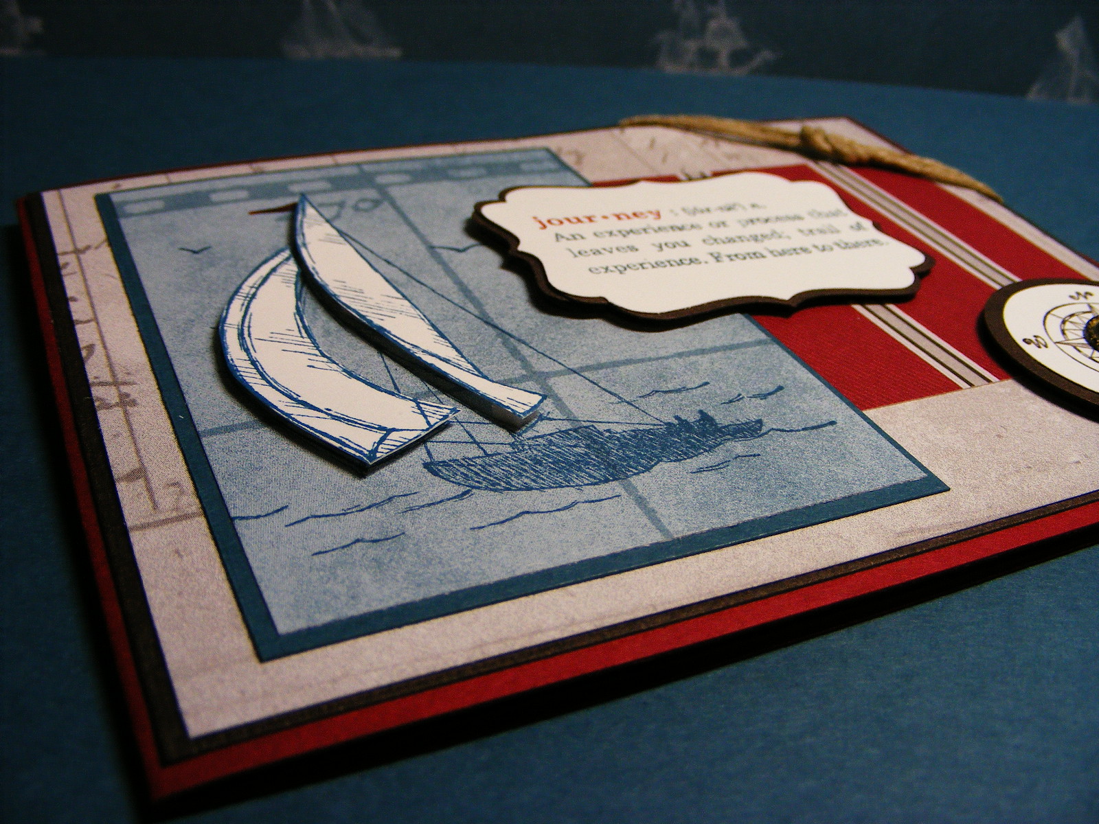
Well the long Victoria Day weekend is finally here. The first long weekend of the season...kick off to the summer...May two-four. There are many reasons to enjoy this weekend, but for me it will simply be a chance to get caught up on some gardening, some stamping and this infernal course I am taking. As three whole days stretch ahead of me, I am a little unsure where to start tackling my To-do list, so I figured I'd relax with a little stamp-therapy. Its been almost a week since I put ink to paper and I needed a while to get the mojo working. Thankfully, there is the summer mini and the great nautical paper and stamps to inspire me. Conveniently the challenge this week over at The Paper Players is a colour one that uses the three colours in the Nautical Expedition DSP:
 So, here is my nautical card...even though I don't have a sea-worthy bone in my body!
I wasn't kidding when I said I wasn't sea-worthy. Boats make me sick...literally. All I have to do is look at a boat bobbing on the waves and I turn green. But I love this suite of new products! There is something about the DSP and stamp images that just appeals to me and inspires my creativity. This card is really straightforward...nothing tricky or special here! At the end of a long, busy week, I don't feel much like doing a play-by-play how-to on this one...I hope you don't mind! If you are stumped by anything, leave a comment and I'll try to help you out. In the meantime, I'm going to enjoy my Friday evening...I hope you do too!

 |
| Card for PP46 using the Sail Away a la carte stamp, and The Open Sea set and Define Your Life sets. |
 |
| Trying to show the popped up, paper-pieced sails |
 |
| My attempt at a nautical-looking knot! |
 |
| Inside of card with sentiment from the Word Play set. |
Monday, April 18, 2011
May's Card Class Preview
I am really trying to do a better job of getting the samples for my classes prepared well in advance. Sometimes it truly is a struggle to keep all the balls in the air as I juggle my family, teaching commitments and Stampin' Up! business...I never quite seem to be caught up! This month, thanks to taking a wee hiatus from workshops for a bit, I've been able to focus on other things...planning ahead is one of them! You'll be happy to know that I have my May monthly class samples ready to go (and photographed, even!). Our feature stamp set this month is Pocket Silhouettes...see some of what this versatile little set can do. Here are the three cards we'll be working on this month:

Pocket Silhouettes was one of the very first stamp sets I bought when I started stamping and it is one that I recommend to my customers who are new to stamping as well. I still love it and reach for it often.
If you'd like to join me to make these three cards, click here for more information about my monthly class and then drop me a line to let me know you'd like to come.
 |
| This set is so versatile! It can be pretty and feminine... |

 |
| ...bold and masculine |
 |
| ...and rich and elegant! Who knew this little set had so much potential! |
 |
| Inside of wedding card with sentiment from Word Play set. |
If you'd like to join me to make these three cards, click here for more information about my monthly class and then drop me a line to let me know you'd like to come.
Sunday, April 10, 2011
More great new Summer Mini Sneak Peeks!
I had some serious stamping fun this evening...so much that I hadn't realized how late it had gotten! This will be a quick post because I have to get to bed, but I couldn't wait to show you one of the cards I created this evening. It uses two of my very favourite items from the upcoming Summer Mini: Nautical Expedition DSP and The Open Sea stamp set. These two items are designed to work perfectly together and because they do, they make creating masculine cards SO easy! Check this out and see what I mean...
Isn't this just fabulous?!? I had so much fun playing around with this card. I did a ton of distressing and aging to make it look sea-worn. I purposely left the sentiment vague so that it could be used for any guy-themed occasion. The "Imagine the Possibilities" sentiment on the front of the card is from the Word Play set...one I really love and use often. I have lots more to show you this week, including some of my spring Stamp-A-Stack line-up. Details later in the week...
 |
| Man-card using great new products from the upcoming Summer Mini available May 1st! |
 |
| Close-up of some to the beautifully detailed artwork in The Open Sea stamp set. |
 |
| Inside of card |
Wednesday, February 2, 2011
Back among the land of the living...
Whew...the stomach flu really SUCKS!! I just spent the last 36 hours in bed wishing death would come quickly. I haven't been that sick in years...and man, am I glad! Now I'm at least upright, though not exactly ready to take on the world. Thankfully, the schools are closed today because we're in the middle of a big snow storm, so I don't have to worry about going to work. I figured it was about time I posted something for you, so here is a Valentine's card I designed to do at a workshop tonight (which, by the way, is also cancelled due to the snow!).
So those of you that reay my blog likely know that I like layers and LOVE embellishments. I am proud to say, this card uses very few of either! I challenged myself to do a simple card and quite like the result. There is only one layer!!! How often does that happen?!? I found this cool technique online somewhere called "faux torn paper" and decided to try it. I have to say, I think I'm gonna use it again! Here is what I did...
Start with a 5" x 3 3/4" piece of whisper white cardstock. Tear a couple of post-it-notes and adhere them to the CS. Then stamp the heart and Love You images randomly in real red and chocolate chip ink respectively. Sponge the whole area with pretty in pink ink and then remove the post-its. Voila...looks like a layer of torn paper. Cool, eh? For the focal image I punched a full heart out of another post-it and stuck it to the CS. I then sponged around it using real red ink. I pulled off the post-it and sponged the heart itself lightly in pretty in pink so it wasn't so starkly white. I stamped the sentiment from the level 2 hostess set called Something to Celebrate in chocolate chip. So quick and easy! Now I couldn't leave this card completely naked, so I added a bit of real red satin ribbon and a heart-shaped Itty Bitty button in the lower right corner.
For the inside, I used the same faux torn paper technique and then stamped the sentiment from the Word Play set that I inked with my markers for a two-colour look. So fast, easy and effective! I was really excited to do this one at my workshop tonight, but now will have to wait until our rescheduled date next week! So much for an early spring!!
 |
| Valentine's card using Valentine Defined set and Something to Celebrate set. |
 |
| Cute little Itty Bitty Button |
 |
| Inside of card - sentiment is from the Word Play set. |
Start with a 5" x 3 3/4" piece of whisper white cardstock. Tear a couple of post-it-notes and adhere them to the CS. Then stamp the heart and Love You images randomly in real red and chocolate chip ink respectively. Sponge the whole area with pretty in pink ink and then remove the post-its. Voila...looks like a layer of torn paper. Cool, eh? For the focal image I punched a full heart out of another post-it and stuck it to the CS. I then sponged around it using real red ink. I pulled off the post-it and sponged the heart itself lightly in pretty in pink so it wasn't so starkly white. I stamped the sentiment from the level 2 hostess set called Something to Celebrate in chocolate chip. So quick and easy! Now I couldn't leave this card completely naked, so I added a bit of real red satin ribbon and a heart-shaped Itty Bitty button in the lower right corner.
For the inside, I used the same faux torn paper technique and then stamped the sentiment from the Word Play set that I inked with my markers for a two-colour look. So fast, easy and effective! I was really excited to do this one at my workshop tonight, but now will have to wait until our rescheduled date next week! So much for an early spring!!
Monday, October 25, 2010
Bargello Ornaments
I finally cleaned off my stamping desk today. The pile of scraps is gone, filed neatly away for future use. Underneath all that paper I found some ornament punch-outs I made using the Bargello technique a while back. I figured I'd better use them, considering the work that went into them! Here is what I came up with...
This really isn't a great photo, but I don't have time to retake it...my son has the stomach flu and I am posting between cleaning up after him and trying to calm him down.
I kept the design for this card really simple because I wanted to showcase the funky design on the ornaments. I started by embossing a piece of Real Red cardstock using my Perfect Polka dots embossing folder and my Big Shot. Then I adhered the lengths of ribbon using glue dots. The the highest ornament is adhered flat and the other two are popped up with dimensionals. The sentiment is from the Word Play set in the main catalogue. I coloured it with my markers, stamped it on Very vanilla and then punched it out. The little bows are made using the 1/8" old olive taffeta ribbon and are adhered with glue dots. I added a little tiny rhinestone jewel at the tip of the sentiment ornament to give it a little bling. I adhered the whole card front to a Very Vanilla card base.
Not terribly involved, if you don't count making the Bargello ornaments!
 |
| CAS card using the Bargello technique |

I kept the design for this card really simple because I wanted to showcase the funky design on the ornaments. I started by embossing a piece of Real Red cardstock using my Perfect Polka dots embossing folder and my Big Shot. Then I adhered the lengths of ribbon using glue dots. The the highest ornament is adhered flat and the other two are popped up with dimensionals. The sentiment is from the Word Play set in the main catalogue. I coloured it with my markers, stamped it on Very vanilla and then punched it out. The little bows are made using the 1/8" old olive taffeta ribbon and are adhered with glue dots. I added a little tiny rhinestone jewel at the tip of the sentiment ornament to give it a little bling. I adhered the whole card front to a Very Vanilla card base.
Not terribly involved, if you don't count making the Bargello ornaments!
Tuesday, October 12, 2010
Swap Inspired Christmas Card
Last month I attended my first ever Stampin' Up! event. It was the Hamilton Regional seminar and I had a great time. One of the best things about getting together with other demonstrators is the swapping!! I am always thrilled to see the amazing things my fellow demonstrators come up with and draw inspriration from their creativity. Today's post is an example of a card that was inspired by a swap card I received at regionals. You can see the original card here. I loved the colour combination in this card. the Night of Navy, Old Olive and Whisper White are just a great, unconventional combo for Christmas. So, with this in mind here is what I came up with (along with the help of my 3-year old son who was "helping" Mommy "do stamps" yesterday!)
Isn't this a great colour combo?!? I love how the Old Olive just pops against the Night of Navy. The snowflakes are just gorgeous. I don't know if it shows in the photo, but I covered them in Dazzling Diamond glitter and they just sparkle like crazy. I coloured the two-tone sentiment using my markers in Real Red and Old Olive. Besides the glitter, the only other embellishment on this card is the Old Olive satin ribbon...so rich looking. The snowflakes inside the card are from the Snow Swirled stamp set and are stamped in Night of Navy. I layered the sentiment on top and in the bottom corner to allow lots of space to write a greeting.
I'm not sure why I love this card so much...but it is certainly another Stamp-A-Stack candidate!
 | |
| Another CAS holiday card! |

 |
| The snowflakes where created using the Northern Frost decorative strip die from the Holiday Mini. |

 |
| The sentiment is from the Word Play stamp set in the main catalogue. LOVE this set! |

 |
| Inside sentiment from Occasional Quotes Hostess Level 3 set. |

I'm not sure why I love this card so much...but it is certainly another Stamp-A-Stack candidate!
Subscribe to:
Posts (Atom)
