Showing posts with label Creative Elements stamp set. Show all posts

Tuesday, March 31, 2015

Last Day to Sale-a-brate!

Today is the final day of our biggest promotion of the year.  It is hard to believe that Sale-a-bration is already ending, but end it will, as of midnight tonight.  Don't miss out on this final chance to earn free exclusive products.  Be sure to place your order before the clock strikes twelve!


Today I have a wedding card I designed for my All-occasions card buffet that ran last weekend.  It uses one of my favourite colour combos:  Island Indigo and gold...

Wedding card featuring the Big News, Petite Petals and Creative Elements (retired) stamp sets.

I started by heat embossing the Island Indigo card base in gold using the flourish image from the Creative Elements stamp set (retired).  The DSP is from the Gold Soiree pack and is embellished using a piece of Island Indigo satin ribbon from Sale-a-bration a couple of years ago.  The sentiment, from the Big News stamp set, is heat embossed in gold and die-cut using the Apothecary Accents framelits.  I stamped the flourish around the edges of the die cut label using Island Indigo ink.

The flowers are from the Petite Petals stamp set, are heat embossed in gold on vellum and are punched with the Petite Petals punch.  The brad is one of the Antique Brads that I heat embossed in gold so that it matched my project.

On the inside I stamped another sentiment from the Big News set in Island Indigo ink and added another gold-embossed vellum flower.

Now for this week's TOTALLY AWESOME Weekly Deals.  The Magnetic Platform is on sale!!  Say goodbye to those sticky notes forever and get in on this deal while it lasts!  Do it today, before the end of Sale-a-bration and qualify for last-minute Sale-a-bration Freebies!

Big Shot Magnetic Platform
Price: $49.95  
Sale: $37.46
Chalk Talk Framelits Die
Price: $30.95 
Sale:  $23.21
File Tabs Edgelits Die by Stampin' Up!
File Tabs Edgelits Die
Price: $13.50 
Sale:  $10.13
Fun Frames Textured Impressions Embossing Folder by Stampin' Up!
Fun Frames Textured Impressions Embossing Folder
Price: $10.95 
Sale:  $8.21
Hearts A Flutter Framelits Die
Price: $30.95  
Sale: $23.21
Squares Collection Framelits Die
Price: $32.95  
Sale: $24.71
Word Bubbles Framelits Die
Price: $30.95 
Sale:  $23.21


    1   

Saturday, February 15, 2014

It's Saturday...

...and here I am, which means it's challenge time over at The Technique Twist.  This week's challenge is using Puzzle Piece Resist technique.  Check out my project:

Thank you card featuring the Creative Elements, Flower Shop, Petite Petals and From My Heart stamp sets and featuring the Puzzle Piece Emboss Resist technique.
Firstly, let me warn you that this is not a quick, 10-minute project, though it is pretty accessible if you have the right tools.  Here is a quick how-to:
  • I started by heat embossing, in gold, the flourish image several times on a piece of 4" x 5-1/4" Whisper White card stock.
  • I die cut a banner, from the embossed card stock, using the Banners Framelits.  I left the die in the negative cardstock after embossing, removing the die cut banner, and then sponged all over with Island Indigo ink, using the die as a mask around the banner-shaped cut-out.
  • I die cut another banner of the same size from Gold Foil card stock and then embossed it using the Pretty Print TIEF.
  • I glued the sponged card stock, inserting the gold banner in the negative space, to a 4-1/8" x 5-3/8" piece of Brushed Gold card stock.
  • I wrapped some gold Baker's twine around the panel several times and tied a bow.  Then I adhered the card front to an Island Indigo card base.
  • The flowers are heat embossed in gold on vellum card stock and then punched out using the Pansy and Petite Petals punches.
  • The sentiment is stamped in Island Indigo ink and then die cut using the Apothecary Accents Framelits.
  • The sentiment and the flowers are adhered using dimensionals.
  • The gold sequins are adhered using glue dots.
 I really like this technique...I've used it several times in the past.  It is always fun to try something new and add a twist.  My twist was the swapping of the embossed gold foil banner...I really like the way it pops and draws attention to the sentiment.  If you have time this long weekend, give this technique a try and play along over at The Technique Twist...we'd love to see your creation!

Tuesday, June 18, 2013

A New Take

If you're looking for The Twisted Challenge Blog Hop click HERE
Last week at my monthly techniques group we did a card that was a remake of one I designed a while back.  I wanted to show them the Puzzle Piece Emboss Resist technique so this is the card I designed to do it:

Birthday card featuring the Puzzle Piece Resist technique with the Creative Elements and Best of Birthdays stamp sets.
I essentially CASE'd myself from this card.  I changed up the colour scheme for a more dramatic look.  Isn't it amazing how just changing the colours can completely alter the look of a project?  For this version I used Smoky Slate, Melon Mambo and Basic Black.  I really love the way the pink pops against the neutral tones.  Next time you're stuck for an idea, try reworking something you've already done...you might just surprise yourself!

Monday, May 27, 2013

Fashionably Late Sketch Inspiration

Well, there goes another weekend!  How is it that they just seem to fly by?!?  I had a To-do List a mile long and barely got through any of it.  Ah, well, there's always next weekend...
Check out this  card I made for a colleague who recently celebrated a birthday.  I was late getting it to her...what else is new??  I used this month's sketch for my layout.

The Sketch


Birthday card featuring the Best of Birthdays stamp set.
I have to say I really like this card!  I sure hope I get something similar on my big day in a few weeks.  I started with some texture Pool Party card stock I had sitting in my stash.  I paper-pierced the label shape using my piercing template...love those things!  I die cut the dress form from Early Espresso card stock and then stamped and heat embossed the flourish from the Creative Elements stamp set in Pool Party.  I used both Vanilla Seam Binding Ribbon and some Victoria Lace Trim in behind the dress form to add a bit of a girlie touch (my colleague is definitely a girlie-girl).  I stamped the greeting in Crumb Cake on Very Vanilla card stock and then punched it out using my XL oval punch.  I stamped the same image again using Pool Party ink and then fussy cut out the banner, which I layered on the Crumb Cake image using dimensionals.  I added some bling and a flower from the Vanilla Flower trim (which I cut down to a smaller size) to the dress form.  I think this design will find it's way into a class in the not-to-distant future.  I love it!
On another note...there are just four more days until the brand new 2013-14 Annual Catalogue goes live!!  I am so excited to get my hands on all the fabulous new products in that amazing new book.  To celebrate I am holding my 3rd Annual New Catalogue Open House coming up this Saturday.  If you haven't already, be sure to confirm your attendance by Thursday.
Have a great week!!

Friday, April 26, 2013

Bridal Congrats

Now that I've finally inked up my Fabulous You stamp set, I'm on a bit of a roll with it!  Today I have a card I designed for a private class I held last night.  Check it out:

Bridal Congrats card featuring the Fabulous You stamp set with sentiment from Sweet Essentials

Inside view with image from Creative Elements and sentiment from Love & Laughter.


Have I mentioned how much I love this shoe image?  It is especially yummy embossed in peweter and blinged up with a strip of rhinestones.  I added some gorgeous embossing with the Elegant Lines TIEF (get this one NOW...it is on the Retiring List!) and made it even more bridal with some organza ribbon.  So pretty and elegant!
Just a reminder that today is the last day to sign up for my Scrapbook in a Day class coming up on May 4th.  There is A LOT of prep involved on my end for this one, so I need the extra lead time.  If you want to attend haven't yet confirmed your spot please do so ASAP so I have the weekend to prep the materials.

Saturday, April 20, 2013

Cheers!

Any-occasion card featuring the Happy Hour stamp set


I am SO excited!  Tonight at 8:00 pm I get a sneak preview of the new 2013-14 Annual Catalogue a full four days before the general population of demonstrators do!  I was successful in earning this wonderful perk as a result of a recent incentive event offered by Stampin' Up.  I can't wait!!!  I will share some inside info with you tomorrow...as much as I am allowed to...and I'll have a good idea of which stamp sets and accessories will be retiring.  The actual retirement list comes out on Wednesday of next week and, as always, items on it are while supplies last, so it is sure to be a busy time for all of us!  The card above is one I designed a while back and I am confident that the stamp set I used will be back for another year.  Happy Hour was new in this year's catty and it is a great one!  So versatile and fun.  On this design I used some Birds of a Feather DSP, as well as some Howlstooth and Scaringbone DSP I had leftover from the fall.  The satin ribbon is also left over from the Holiday catalogue, but works perfectly on this card.  I couldn't resist adding a touch of sparkle with the Silver Glimmer Paper and a few rhinestones.  The liquid in the glass is paper-pieced, much easier than trying to ink with markers!  The colour scheme is Summer Starfruit, Basic Gray, Basic Black and Whisper White.
On another note, I want to remind you that time is running out to register for my Family Canvas class coming up this Friday, April 26th at 6:45 pm.  In case you missed it, here is the project we'll be creating:


Perfect for displaying treasured family photos, this project would make a lovely gift for Mother's Day, a new baby or just to keep for yourself to display in your home.  The class fee of $20 includes all materials and supplies to create one of the canvases pictured above, including the wooden easel to display it on!  Please indicate yoru colour choice when you register.  If desired, bring three photos with you to class to complete your project.  You'll need one 4"x6", one 3-1/2"x5" and one 2"x3".  Be sure to contact me to reserve your seat before the 23rd.

Thursday, April 11, 2013

My Turn for April!

Today I get to show you my project for April at Craft Project Central.  Check it out:

Family Canvas and Card designed by Yours Truly!
I also did this same project in Midnight Muse and I am offering both options in a class on April 26th.  Click the Upcoming Classes and Events tab at the top of this page for additional details.  If you can't make it to my class (or even if you can!), you can subscribe to April over at Craft project Central to get the full-colour step-by-step tutorial.  Just $10 gets you 10 great projects...lots to keep you busy all month long!  I am also giving away a free subscription.  To enter the draw just leave a comment on any post dated April 1-15th, 2013.  I will post the winner on the 16th.  Good luck and happy stamping!

Tuesday, June 12, 2012

Emerging Butterflies

Today I have a card I designed for my monthly techniques group that meets this week.  It uses a technique sometimes known as Emerging Colours or Joseph's coat.  Whatever you call it, it is gorgeous!  Have a look:
Pretty any-occasion card featuring the Emerging Colours technique and the Creative Elements and Itty Bitty Banners stamp sets.
Once again, I couldn't resist pulling out some of my new catty goodies!  The DSP in the background is from the Patio Party pack...lots to love in there, but my favourite pattern is definitely these little bitty butterflies. To get the multi-coloured butterflies on the focal image I sponged Summer Starfruit, Baja Breeze and Primrose Petals ink on a square of whisper white randomly.  I then stamped the butterfly image from Creative Elements in Versamark and clear embossed them.  I then brayerd on Midnight Muse ink, covering the sponged colour.  The embossing resists the ink, so I wiped off the excess with a paper towel and voila...butterflies that pop out in vibrant colour.  I added some stitched satin ribbon in Summer Starfruit and a butterfly punched, with the new Elegant Butterfly punch, in Primrose Petals.  I added a rhinestone body to the butterfly, as well as a little banner and one of the to-die-for little In-Colour Dahlias.  Gotta love new stuff!!

Tuesday, June 5, 2012

Faux metal box

Today I have the second project in my series of Faux Patina samples.  This one is a little box I made using the Petite Pocket die.  Super easy to put a box together with that die...though this one took a little longer because of the Faux Patina technique.  The result is pretty cool though...check it out...

Faux-metal box made using the Petite Pocket die and the Faux Patina technique and featuring the Creative Elements and Tiny Tags stamp sets

Tag detail.
I have to say that these photos really don't do it much justice...they're overexposed AGAIN!  I really need to get a proper light box for taking photos of my stuff!    Anyhow...neat project and it goes perfectly with the card I posted yesterday for a lovely gift ensemble for Father's Day.  This box will hold a bottle of cologne quite nicely.
Tomorrow I'm heading waaayyy out of my comfort zone and showing you an 8x8 scrapbook page I did using this technique...stay tuned...

Wednesday, May 30, 2012

Another XL Card

Today I have another of the retirement cards I was asked to make for our retiring colleagues at school.  This one is pretty and feminine and is for a member of my Inky Paws monthly club.  Inky Paws is our monthly card class that I run in the staff room after school.  Have a look...

Soft and pretty card for a retiring colleague.  Sentiment is from the retired Well Scripted set.  Flourish on the butterfly is from the Creative Elements set.  The flower is inspired by the cover of last month's Stampin' Success (Stampin' Up!'s demonstrator magazine)

Flower detail

Inside detail with images from the Creative Elements set.
Sooo...this one took a while.  That flower was not quick or easy, but so worth the effort.  I wanted to do something over-the-top for this special lady, as she will be moving to the west coast to be near her son and his family.  I likely won't get to stamp with her anytime soon and I wanted to give her something special to honour her retirement as well as our many hours spent stamping together.  I sure hope she likes it!

On another note...time is running out to order retiring stamps and accessories from the Last Chance List.  If you haven't already done so, get your order in before tomorrow at midnight or you will be disappointed.  Also, if you haven't yet RSVP'd for my New Catalogue Open House...what are you waiting for??  Leave me a comment here or drop me a quick email to let me know you'll be joining us on the 2nd.  It promises to be a ton of fun!!

Wednesday, May 2, 2012

Farewell Finial Press

I have to say that when I saw the Finial Press Textured Impressions folder on the retiring list I thought it must have been a typo.  I couldn't imagine that it could possibly be leaving us, but alas, it is true.  As of the end of May one of my most favourite embossing folders will go away (~sob~).
In honour of it's retirement I created this card that uses the Double Embossing technique.  Have a look...

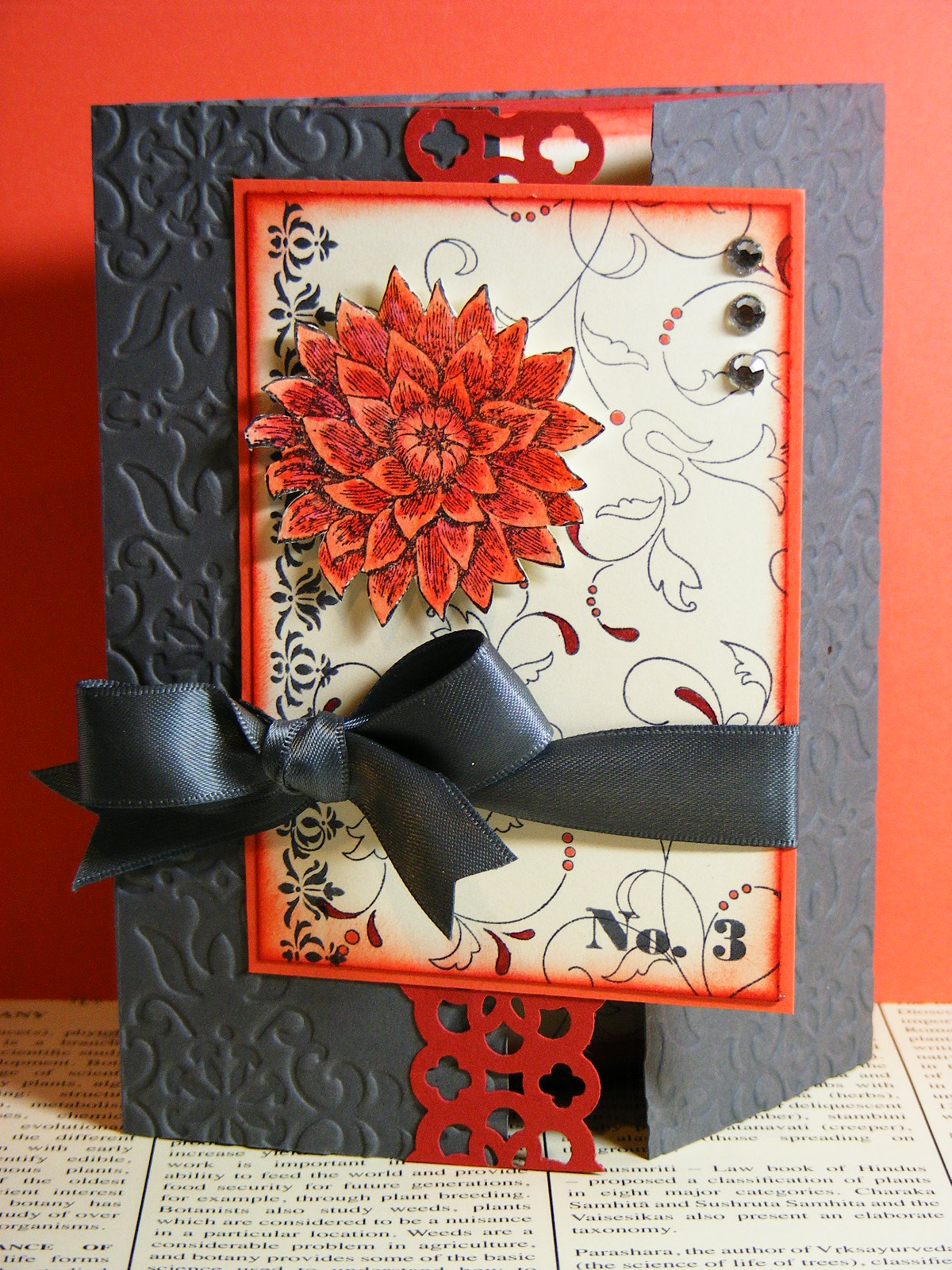
Pretty Thank You card featuring the Double Embossing technique and the Creative Elements and Established Elegance stamp sets.  Sentiment is from Rue des Fleurs.

I have to say that I really love doing vintage-style cards.  They are so easy to pull together and such fun to distress and sponge.  This one really is made by the cool background.  Here is a quick how-to for this technique.
Starting with the embossing folder of your choice, apply Versamark ink all over the smooth side (non-bumpy side) of the folder.  Insert DSP or card stock into the folder and run it through the Big Shot with usual sandwich.  Remove the embossed paper and pour embossing powder all over the raised pattern.  The powder will stick to the Versamark, leaving the raised pattern free from powder.  Heat the powder until it melts and takes on that beautiful shine.  If desired, sponge ink over the raised pattern to accentuate the pattern (I didn't do that on this card because I wanted the newsprint text to show up).   The rest of this card is just about distressing and sponging.  Such a fun and easy card to put together.  If you haven't tried a vintage-style card, what are you waiting for?  It is easier than it looks...and tons of fun!

On another note...in case you missed it, yesterday I told you about some exciting Blog Candy I am giving away this week.  In honour of my Guest Designer gig over at Craft Project Central, I am giving away a free 1 month subscription to one of my lucky blog readers.  To enter, just leave a comment on any (or every!) post between May 1st and May 8th.  The more you comment the more entries you'll have!  I will announce the winner on May 9th and you'll have the rest of the month to peruse this month's great projects over at CPC.  Be sure to stop by here tomorrow...I'll have another of this month's projects to show you...

Sunday, January 15, 2012

Amour for the Monkey

I was asked to be a guest designer for this week's challenge over at A La Card Monkey.  The sketch is a simple one which allows for lots of creativity and plenty of room for interpretation.  Since my week was SOOO busy last week, I found myself throwing this card together after work on Friday, rushing to meet my deadline!  The result is not my favourite card ever, but it is a nice, understated Valentine that  would be perfect for just about anyone.
Vintage-inspired Valentine's card for this week's A La Card Monkey challenge.

Inside view
Ok, I used a bunch of different stamp sets for this card.  I pulled one or more images from each of the following sets:  French Foliage, Creative Elements, Artistic Etchings, and Take it to Heart.  My colour scheme was simple:  Poppy Parade, Soft Suede and Very Vanilla.  I did manage to take my new Edgelits for a test drive, using the scalloped die to cut the bottom edge of my DSP layer.  I have to say they are as easy to use as the new Framelits...and they're a snap!  If you haven't already ordered yours, you'll want to do so soon...you'll wonder how you ever lived without them!
Now for other news...as some of you are aware, my master bathroom has been under renovation for more than a year and a half.  What started as a simple shower project turned into an almost complete remodel.  It has been a huge source of stress waiting for it to finally get done (yes, my husband was doing this project himself!).  Well, I am thrilled to say that my bathroom is DONE!!!!  My son is having a bath in there as I type this post...and when he's done it is SO my turn!  I am going to have the longest bath in history...I may not get out until I have to go to work tomorrow morning!  If you don't hear from me over the next couple of days...you'll know where I am...

Sunday, September 4, 2011

A tough one...

...that's what I thought when I saw this week's colour challenge at Pals Paper Arts.  The challenge was to use basic grey, calypso coral and riding hood red on a card.  That is not a colour combo I would EVER choose to use myself, but since I'm always up for a good challenge I gave it the ol' college try.  I figured I'd kill two challenges with one card by creating a gate-fold card for the Friday Mash-up as well.  They not only wanted a gate-fold, but also to use numbers somewhere on the card as well!  Talk about a week of tough challenges!  Anyhoo...here's what I came up with:
Gate-fold card for MU22 and PPA109 using the Creative Elements stamp set

Inside of card
So, who'da thought this colour combo would be one I really like???  I discovered while watercolouring the flower that calypso coral and riding hood red blend really nicely together!  The basic grey provides a rich looking base made even lovelier with the vintage wallpaper embossing folder.  I also love the richness of the basic grey satin ribbon and the subtle bling of the rhinestones.  Conveniently, the Creative Elements set includes that No.3 stamp, so it was easy to include the required numbers element for the Mash-up.  The only thing this card is missing is a sentiment!  I  just couldn't come up with a place to put one that worked with the layout.  When I am ready to use it I will stamp an appropriate sentiment for the inside...in the meantime it remains sentimentless!  I actually really enjoyed both of these challenges...they both forced me to think outside of my stamping box and try new things which, really, is why I love playing along!

Thursday, July 28, 2011

Mojo with a Flourish

Today's card is another one I designed for a couple of online challenges:  this week's Mojo Monday sketch and the Flourish challenge at Hand Stamped Sentiments.  First of all, here is the Mojo sketch:
...and here is my card:


Card for Mojo201 and HSS77 using the Creative Elements stamp set as well as a sentiment from Pursuit of Happiness


Close up of layering detail.
I have to say that as soon as I saw the challenge at Hand Stamped Sentiments I thought of the new Creative Elements stamp set.  I just love the flourish image in that set; especially because it lends itself to colouring!  That is exactly what I did on this card.  I stamped the flourish and then coloured it using my markers.  I pulled my colour scheme from the Paisley Petals DSP:  cherry cobbler, always artichoke, marina mist and cajun craze.  That certainly isn't a colour combo I would generally choose, but it works so well in the paper I had to give it a go!  I do like the way the stamped image complements the pattern in the DSP behind it and the butterflies just add a touch of whimsy.  The sentiment is from the new Pursuit of Happiness set from the new catalogue...lots of great quotes and sentiments in that set! 
On a completely different note, I have been working on my class line-up for August!  Yes, summer freedom is nearly over and I have to get back to a more regular schedule.  In the next day or so I will post samples and details about two upcoming classes:  my monthly card class (featuring the new Easy Events set) and an introduction to watercolouring class.  Click on the Upcoming Events tab at the top of the page for more information.

Saturday, July 23, 2011

A Burst of Creativity!

Today was a perfect day:  lots of quality time with my little guy and some time to play with my new stamping goodies!  It was another HOT one here today...still no rain.  We spent time in the pool this afternoon...about the only place it was comfortable being outside!  I sure hope it rains soon...
Now...on to today's project.  It has been several weeks since I've been able to participate in any online challenges so I decided it was high time I got back to it.  Today's card is  based on this week's Mojo Monday sketch.  Here is the sketch:
And here is my card:

Card for MOJO200 using the new Creative Elements stamp set and sentiment from Field Flowers.

Close up of my popped-up flower

LOVE the new Designer Frames embossing folders!

Inside of card featuring Mocha Morning DSP...so rich and yummy!
This card is really a study in texture.  There are so many different textures going on you just have to touch it!  For starters, I stamped the flourish from Creative Elements in soft suede on a card base of the same colour.  I then ran it through my Big Shot using my Vintage Wallpaper embossing folder.  I wrapped a piece of black striped 1 1/4" grosgrain ribbon around the card base and added a bow tied with an antique brad.  I then cut a strip of the flocked Mocha Morning specialty paper and added a scalloped edge in basic black textured cardstock, adhering it to the cardfront.  Next I stamped the flower three times on watercolour paper using black Staz-on ink.  I watercoloured all three flowers using crumb cake and soft suede inks and my aquapainter.  I then fussy-cut out the full flower for the bottom layer, as well as the middle and top layers from the other stamped images.  I layered the flower using dimensionals to give it depth.  I then brushed it lightly with champagne mist shimmer paint using my aquapainter to give it some sparkle and richness.  On a separate scrap of very vanilla cardstock I stamped the butterfly in crumb cake ink and the sentiment in basic black.  I then ran the scrap through the Big Shot using the rectangular designer frame embossing folder.  I fussy cut out the frame and sponged the edges using soft suede ink.  I adhered both the frame and the flower to the card.  Voila...a gorgeous-so-rich-you-want-to-touch-it card!  I am SO in love with these new products!  I can't wait to show them to my customers...they're going to love them as much as I do!
I really liked working with this sketch, so tomorrow I'll have another card using the same sketch for you!
Related Posts Plugin for WordPress, Blogger...