Showing posts with label Broadsheet Alphabet stamp set. Show all posts

Sunday, April 21, 2013

New Catty tidbits and a new project

Well, last night I got my first glimpse at the new 2013-14 Annual Catalogue.  All I can say is WOW!!  You are going to be blown away with all of the fabulous new products:  punches, Framelits, stamp sets to coordinate with both, embellishments, DSP...every page contains another fabulous new item!  The catalouge itself is fresh, and vibrant and really easy to read.  I can't wait to show it to you all, but first we have to say good-bye to some beloved products to make room for all the new!  The retiring lists post on Wednesday...be sure to check back here as I will have links to both for you to browse.  The most important thing to remember is that anything on the Accessories list will only be available while supplies last, so you'll want to take get the items on your wishlist sooner than later.  Stamps are guaranteed to be available until June 3rd.
Now for something new from CPC.  Have a look:

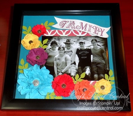
Floral scrapbook Wall-Hanging designed by Christy Fulk
Do you have an extra special family picture that you’d like to display, but are getting tired of the plain-frame look?  Here’s a way to show off your family picture and your creativity!  This is a 10" x 10" scrapbook page inserted into a shadow box.  Putting it into a shadow box also enables you to use a lot of dimension that would normally be too thick for a scrapbook album!  This project can easily be customized to the colors of the room you want to display it in. To access the tutorial for this project, visit Craft Project Central and subscribe to April.  Then stop by Christy's blog and let her know how much you like her project!

Monday, June 18, 2012

Last of the XL Babies

Yesterday I finally finished the last of my XL Baby cards.  I am really glad to have that task behind me, as it proved to be a bigger challenge than I had expected.  I procrastinated more than I likely should have, but, now that they're done, I am relieved.  See what you think...

Another Over-sized baby card featuring the new Baby Boutique stamp set, as well as the Broadsheet Alphabet.  The DSP is from the Domestic Goddess pack from last year's catty.
So, is this gender-neutral??  It is for a gal who doesn't know what she is having, so I wanted to keep it as neutral as possible.  I figured the Pool Party and Calypso Coral were a good combo...bright, yet suitably babyish.  I love the new Baby Boutique stamp set in the new Annual Catalogue and especially love the way it works with the Broadsheet Alphabet set.  All of the squares are punched with the 1 1/4" square and then layered on the scalloped square.  Thankfully they filled up the card rather well, given that the base is 8-1/2" x 5-1/2"!  I finished these card none too soon...the shower for these moms-to-be is next week...on my birthday!  Don't know yet if I'll be able to make it to the actual shower...hubby has plans for my big day...but I sure hope these ladies like their cards.  Later this week I am holding a Baby-Thank-You-Card-Bonanza for the three moms-to-be.  They are all getting together with me to make 80 thank you cards!  I've been working on some designs that I'll show you tomorrow.  In the meantime, have a great day!

Friday, February 17, 2012

R is for Retire

...boy do I wish that applied to me!  Sadly I still have another 14 years to go before I can enjoy the freedom retirement brings.  Lucky for a colleague of mine, freedom is her reality.  She recently retired after more than 30 years at our school.  She is an institution there and her absence is already being felt!  It is only fitting that I create a special card to honour someone who has done so much to enrich the life of the countless students who have walked the halls of our high school.  This is the card I designed for her...
Retirement card featuring the Broadsheet and Occasions Alphabet stamp sets .

Inside detail with stamped images from the Vintage Vogue stamp set
I have to say I quite like this colour combo.  I took it from the Attic Boutique DSP:  pool party, daffodil delight and soft suede.  It is hard to tell in the photo, but I heat embossed the R using a long-retired embossing powder called Gold Glory.  I sure wish SU would bring that one back...it works perfectly with soft suede for an aged, vintage look.  I created the 3D flowers by punching them out with my boho blossoms punch and then burnishing them with my stylus on the foam mat from my mat pack.  They curl right up, making them easy to layer for pretty three dimensional flowers.  This card took a while to put together but was worth the effort.  I know my colleague appreciated the details I added and it was fun creating a fussy card after all the CAS ones I've been doing lately! 
This is the Family Day long weekend here in Ontario and I am SO excited to have nothing planned at all.  I have an intro to My Digital Studio class tonight and then I have the whole weekend to stamp and spend with my family.  I can't wait!!!

Friday, January 7, 2011

Valentine for my hubby

I just recently got  the Puns from the Past stamp set.  It is one that I have long covetted and am thrilled to finally own!  Last weekend I put it to good use creating this Valentine for my husband:

Masculine Valentine made  using Puns from the Past and Broadsheet Alphabet stamp sets

Close up of focal image

Inside of card
I was rather pleased with the way this turned out.  As with most of my projects I started not really knowing where it was going.  I knew I wanted to use the Love Letters DSP and the Puns from the Past set...other than that I had no real plan for this card!  In the end, here is what I ended up doing:
Using a large clear block, I positioned the "U" & "R" from the Broadsheet Alphabet set together and then stamped them on very vanilla cardstock in cherry cobbler ink (this was before I realized the red in the paper was riding hood red!).  I punched it out using my 2 1/2" circle punch.  I then stamped the typewriter in basic black and sponged the edges in the same colour.  I added a distressed piece of riding hood red striped ribbon and then layered the focal image on a 3" circle cut from Love Letter DSP using my Circle Scissor Plus.  I then layered that on a 3 1/2" circle cut from basic black cardstock.  On a separate piece of very vanilla, I stamped the sentiment again, punching it out with my word window punch.  Because the sentiment is quite short, I reinserted the punched piece into the punch and punched it again, shortening it.  I adhered the sentiment using a dimensional.  To construct the card, I started with a 5" x 5" card base in basic black.  I layered a 4 3/4" x 4 3/4" piece of Love Letter DSP on top and then added another layer of Newsprint DSP on top of that.  I adhered the focal image centred on the card base.  I punched out several hearts using my heart to heart punch and added them in the corners, popping some up with dimensionals.
For the inside of the card, I stamped the typewriter on a piece of very vanilla textured cardstock, sponged the edges in black and layered it on another piece of Love Letters DSP.  On a separate piece of very vanilla cs I stamped the "I" & "U" from the broadsheet alphabet set and punched it out using the 2 1/2" circle punch.  I sponged the edges in basic black, added another heart from my heart to heart punch and adhered the whole thing to the inside of the card.
Many of us stampers often struggle with making masculine cards.  That's one of the reasons I wanted the Puns from  The Past set...it works really well for the men in our lives!  I think my hubby will like this one!
Related Posts Plugin for WordPress, Blogger...